

Menswear Spring/Summer Collection
Print & Graphic–Led Menswear Design Story
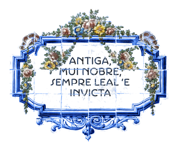
A concept-led Spring/Summer menswear collection inspired by the architecture and decorative tilework of Porto, Portugal. The project explores print, graphic, and surface development translated across a cohesive menswear range.
The brief was to develop a print-led menswear range that balanced strong surface identity with wearable silhouettes suitable for Spring/Summer delivery.
Focus areas:
Print & surface design | Graphic motifs | Silhouette development | Product Application
Featuring:
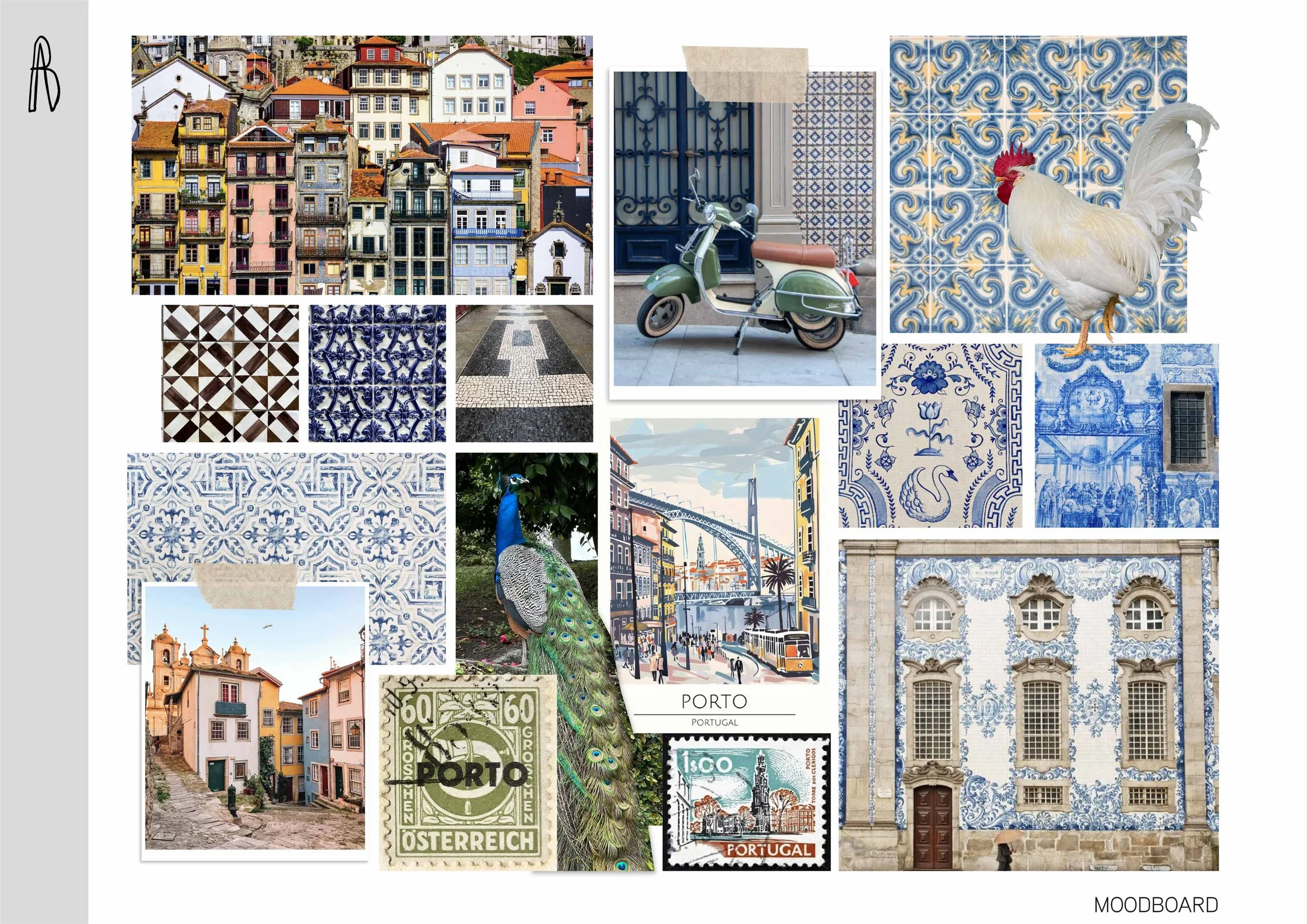
Mood Board
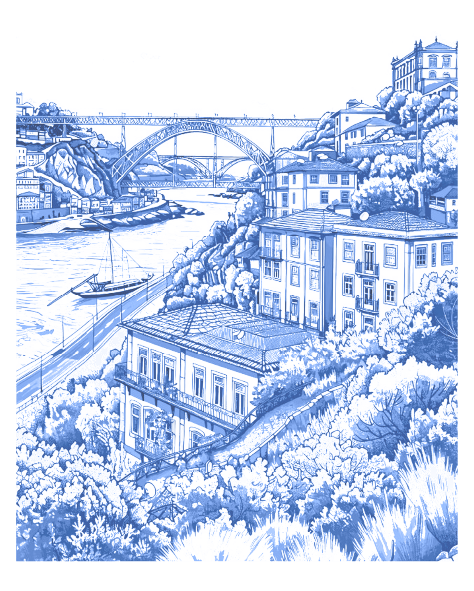
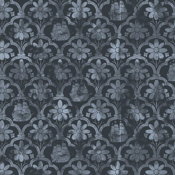
Visual research focused on architectural pattern, ceramic surfaces, and street-level textures to inform motif structure and surface rhythm.
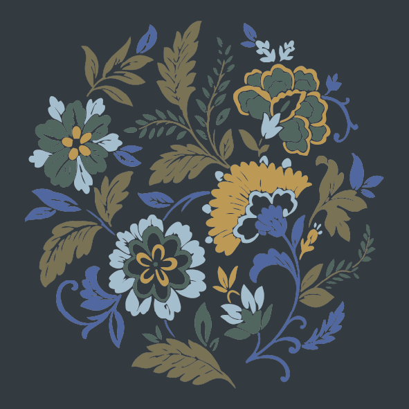
A restrained, porcelain-inspired palette was developed to support tonal variation within large-scale prints while maintaining wearability.
Color palette
#1b3c5e
#f7f4f0
#aec8ce
#f4d3a6
#b28172
#92a093
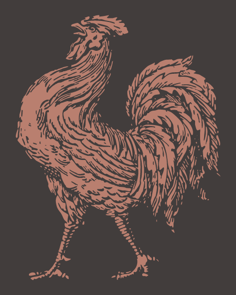
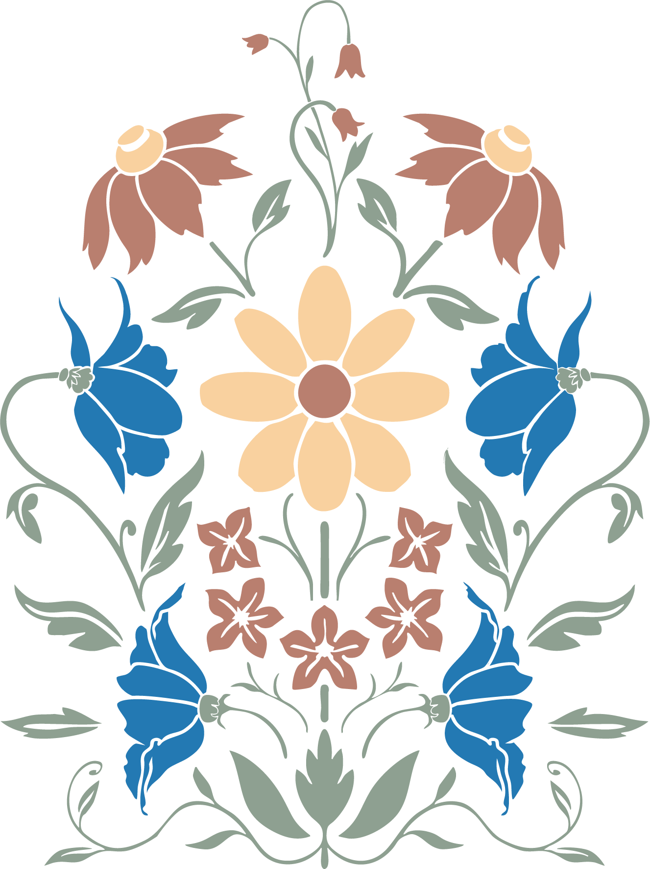
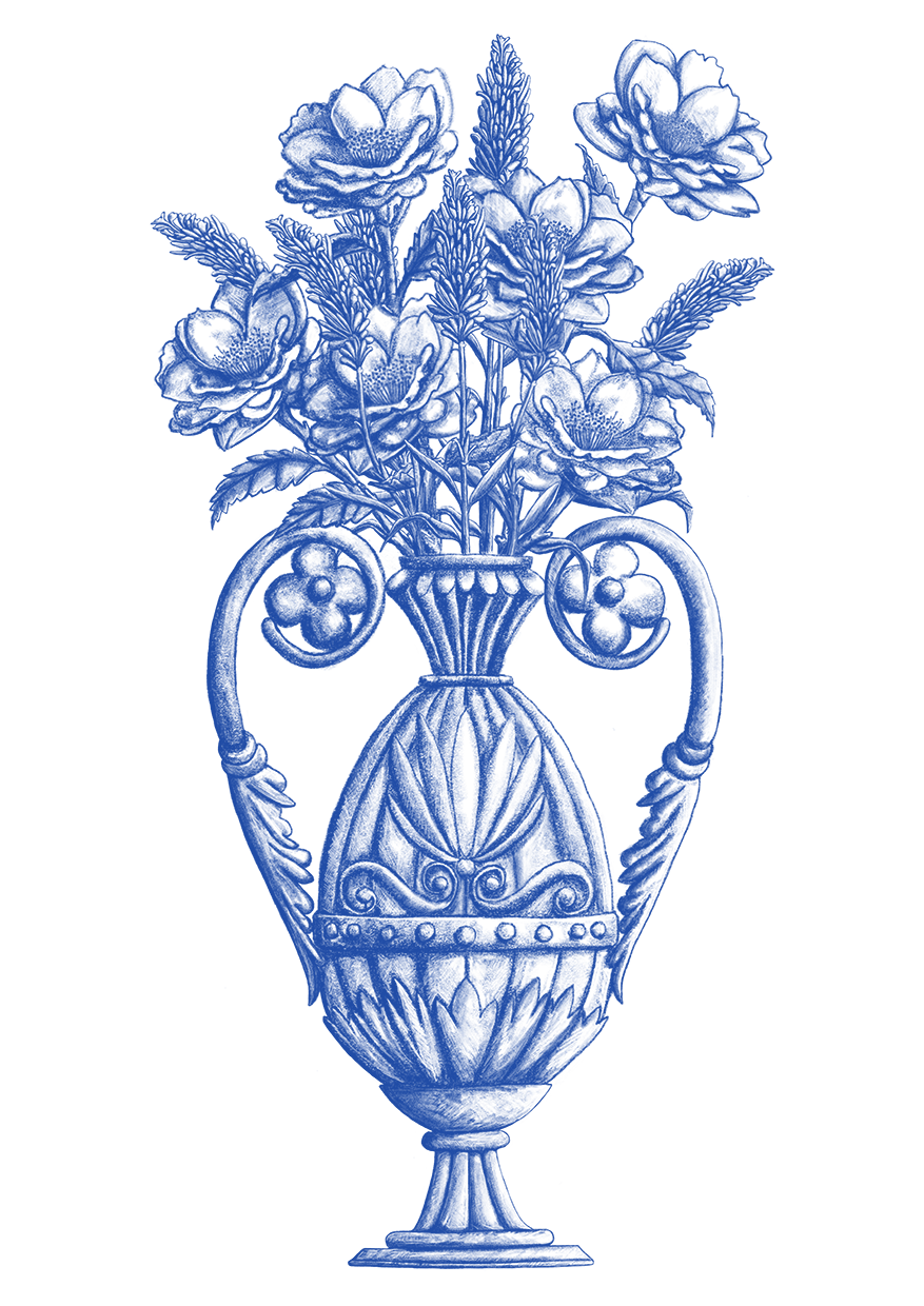
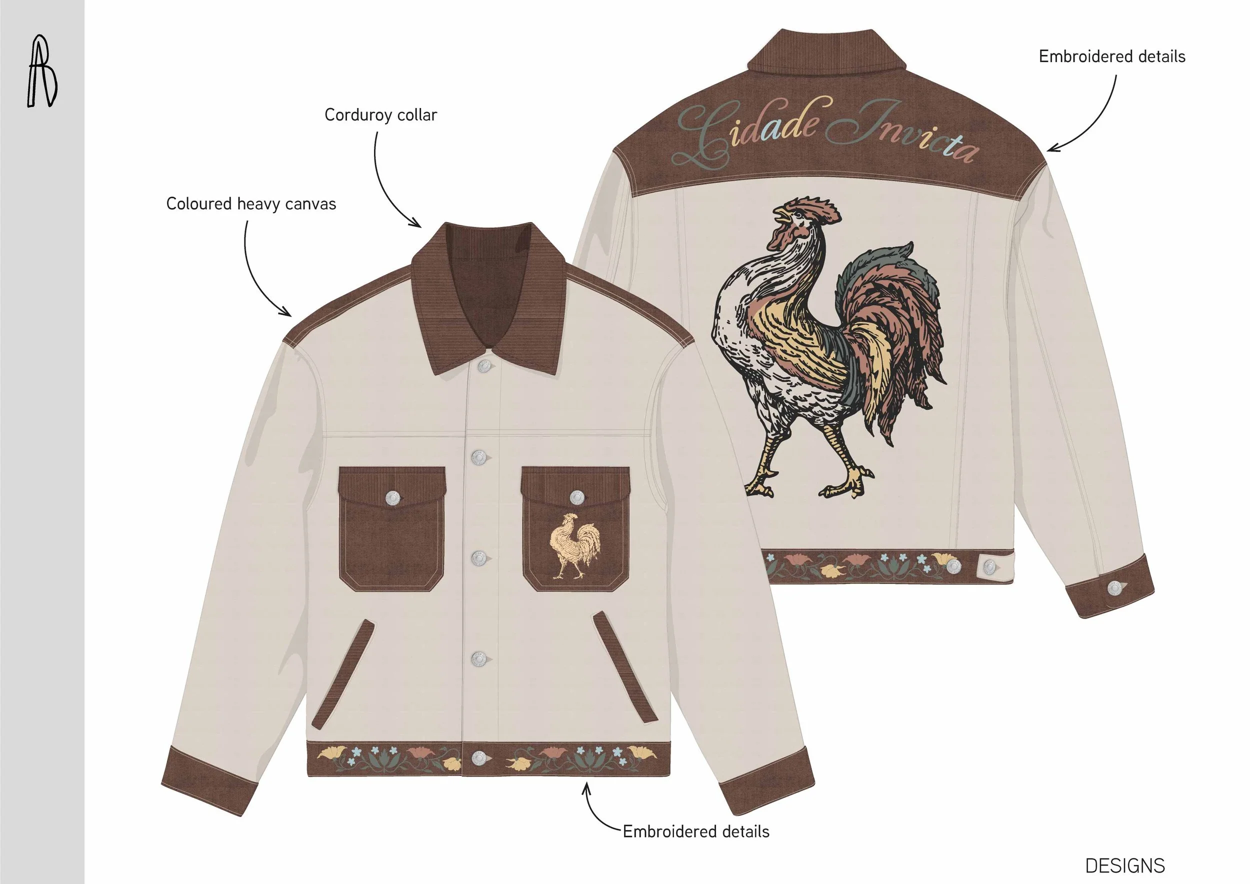
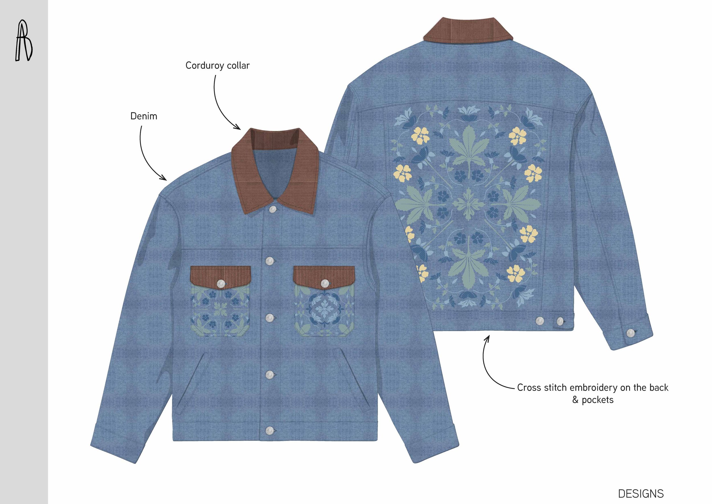
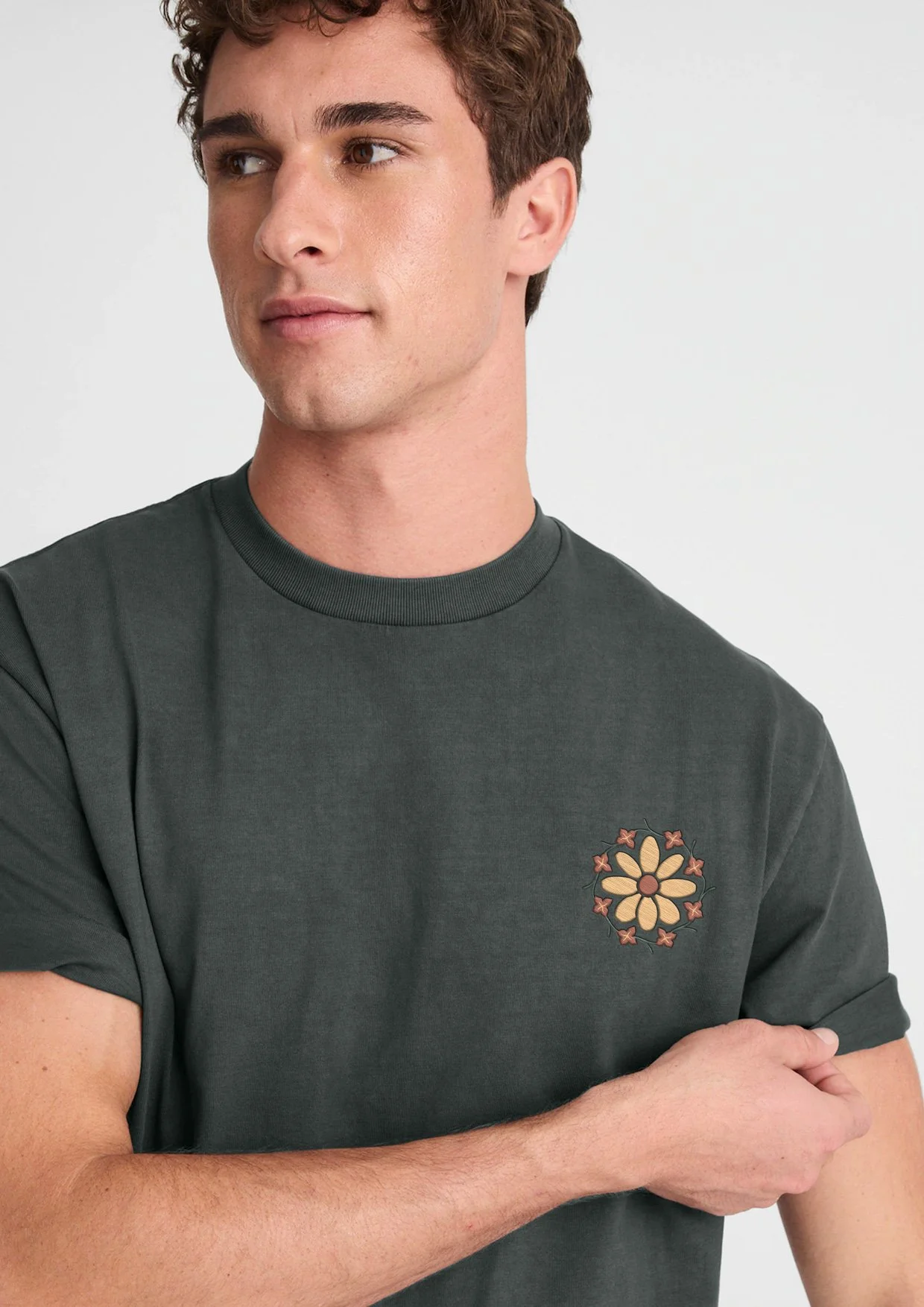
Complementary graphic motifs developed for embroidery, badges, and dimensional applications across the range.
Badges
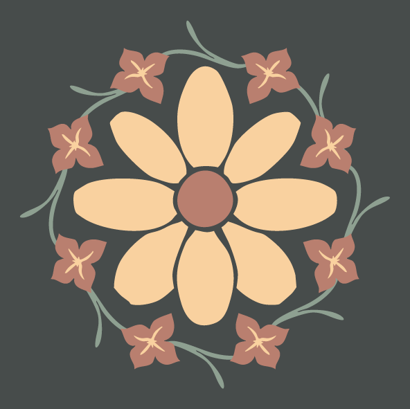
Repeat designs explore variation in scale and density to allow application across different garment types and price points.
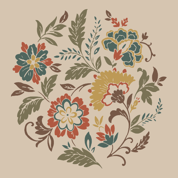
Prints & GRAPHICS
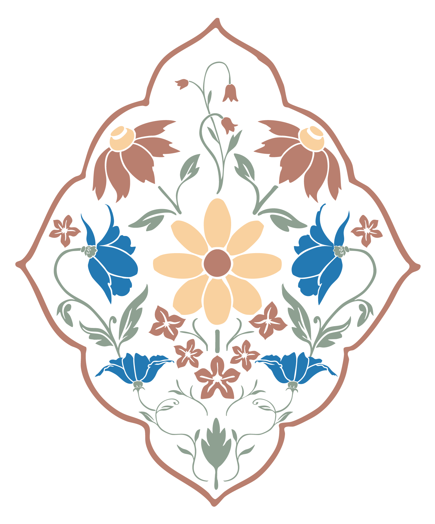
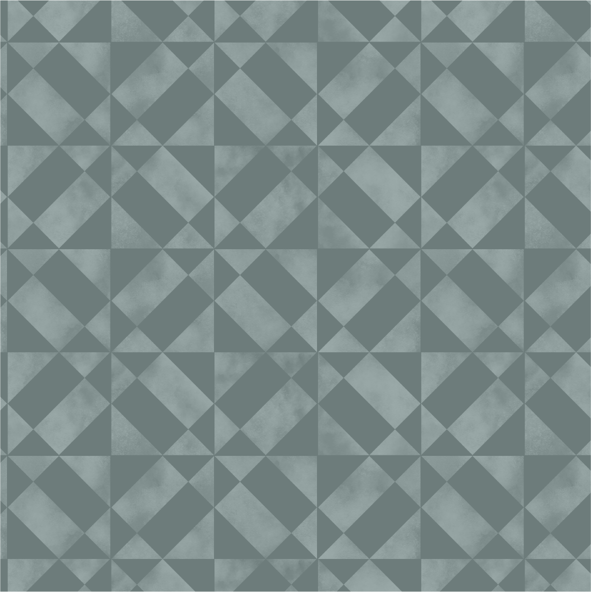
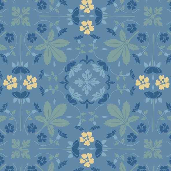
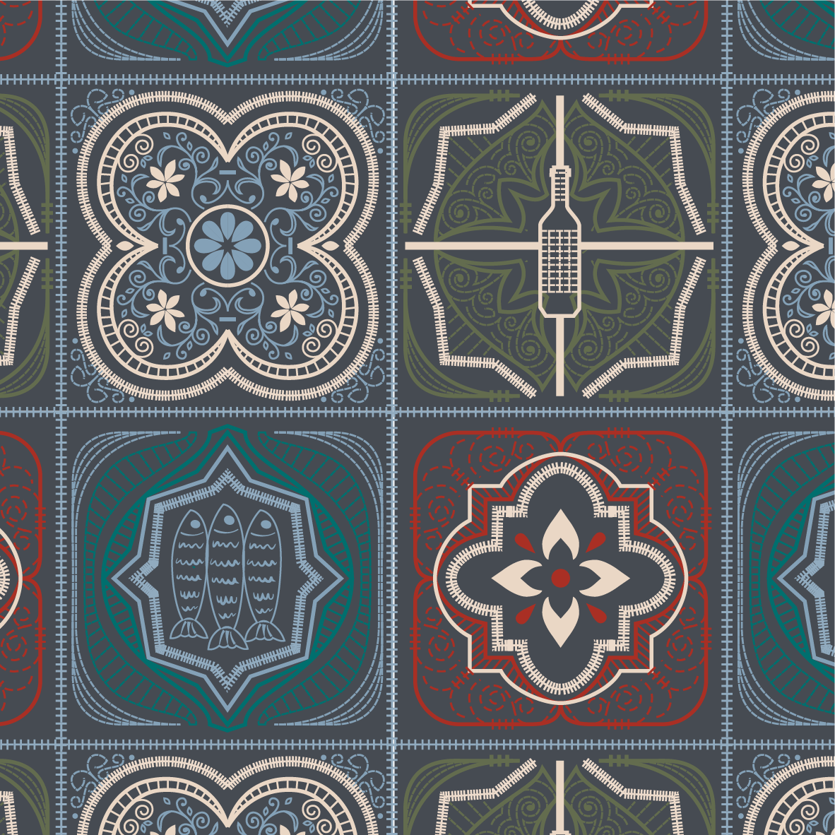
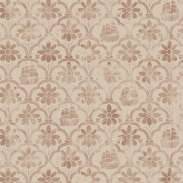
Tile print 1
PRINT REPEATS
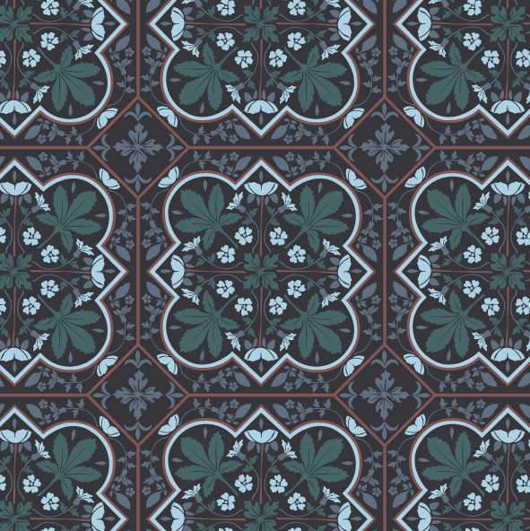
Tile print 3
Tile print 2
Tile print 4
Tile print 5
Tile print 6
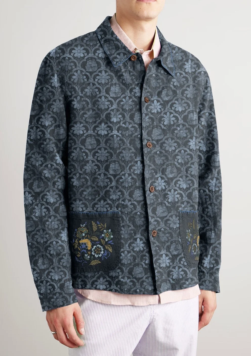
Tile-based repeat systems developed at multiple scales to allow flexibility across garment types.
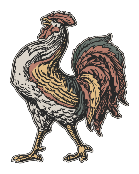
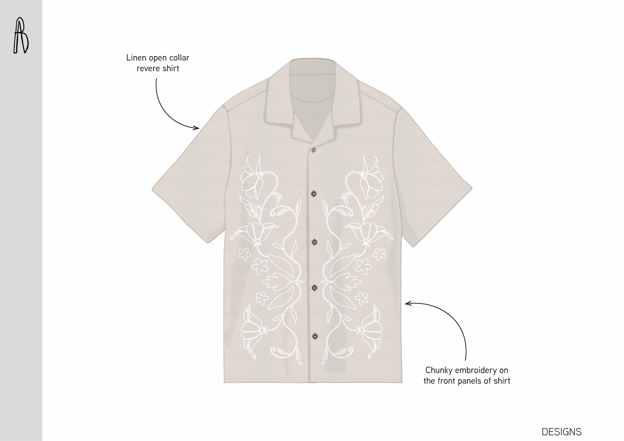
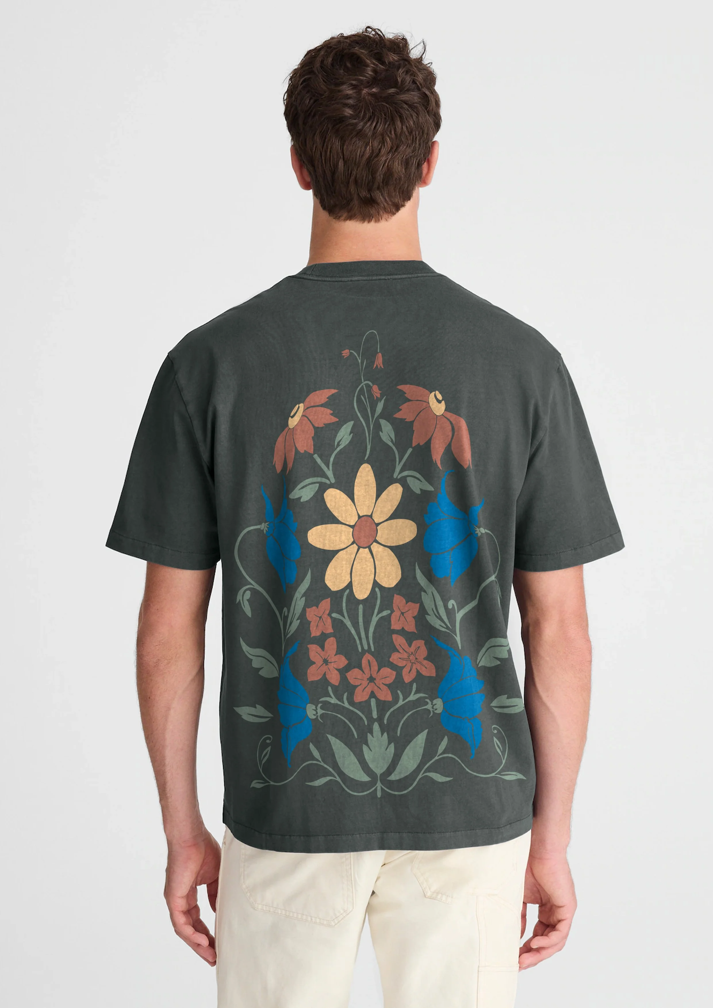
Illustrative graphics derived from architectural references, designed for placement and embroidery-led applications.
GRAPHICS

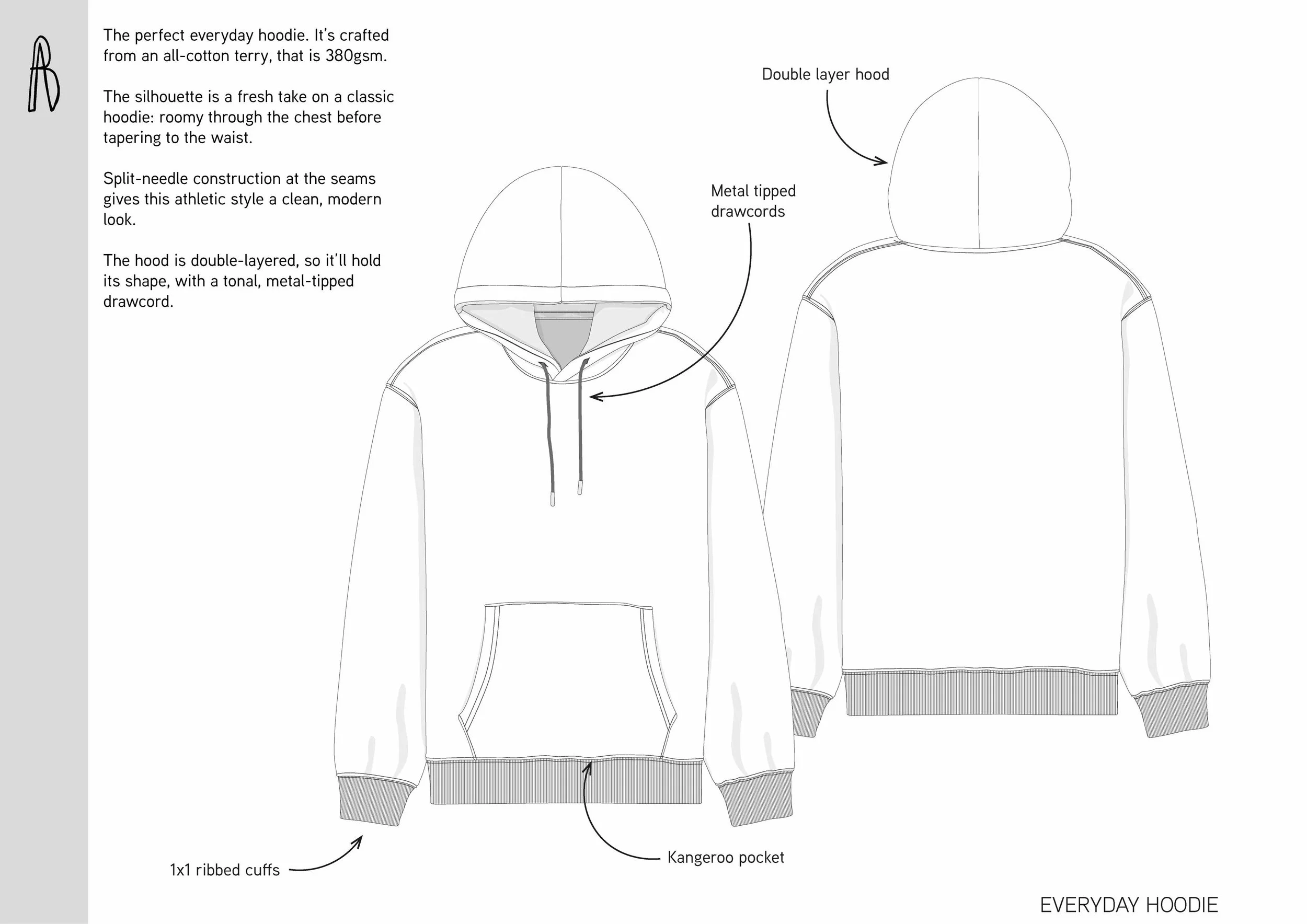
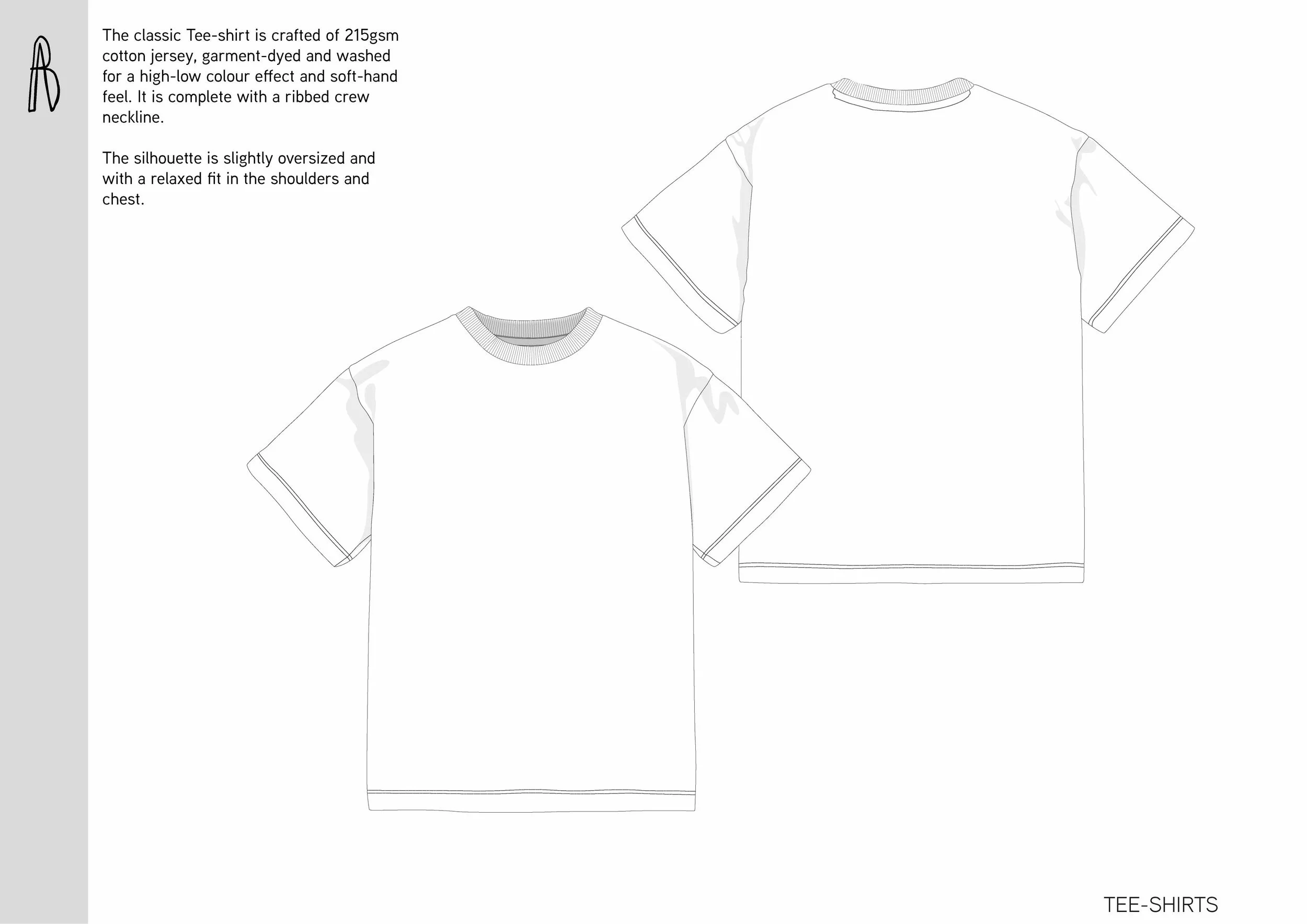
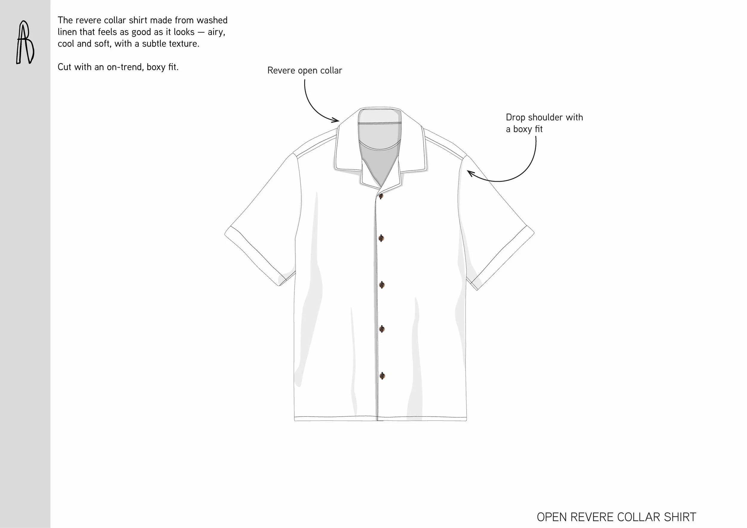
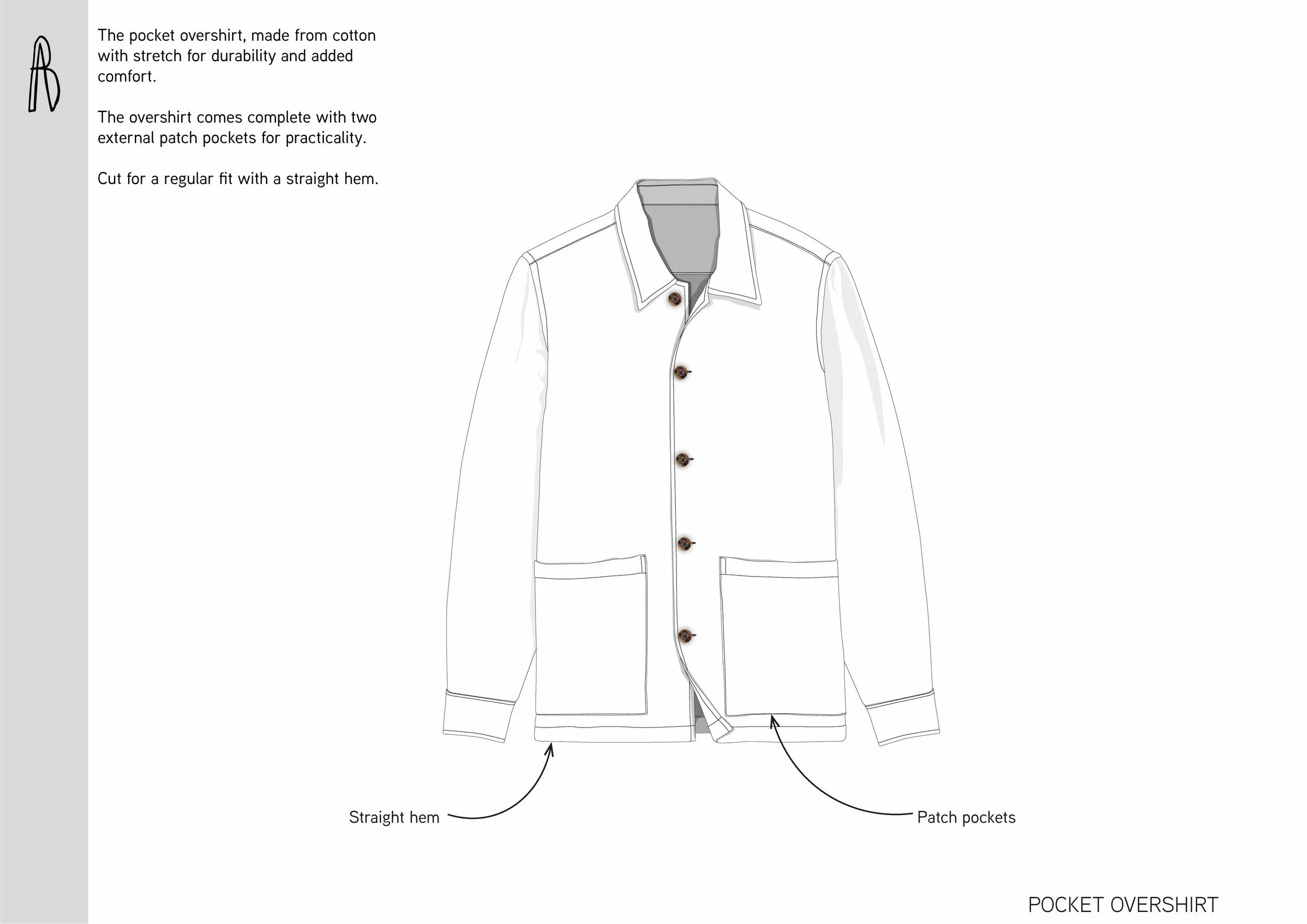
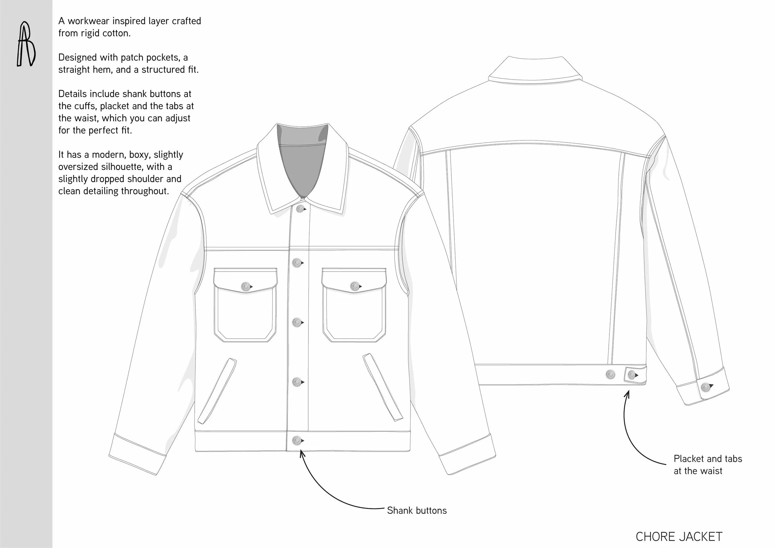
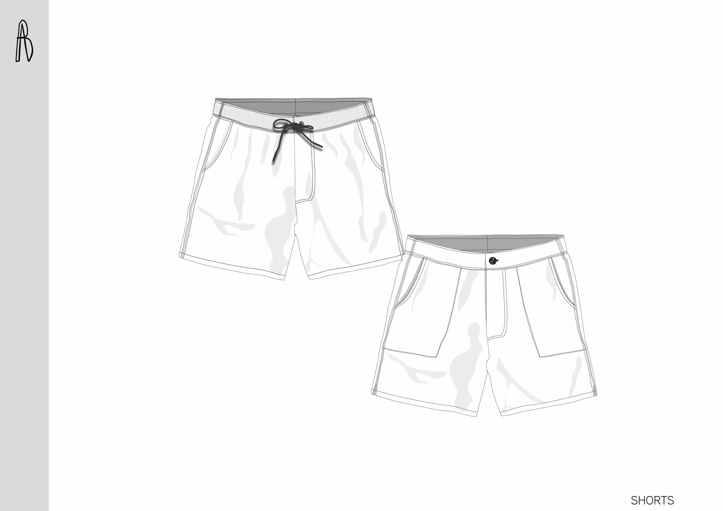
Outline flats defining garment silhouette, proportion, and fit direction across the Spring/Summer menswear collection.
FLATS
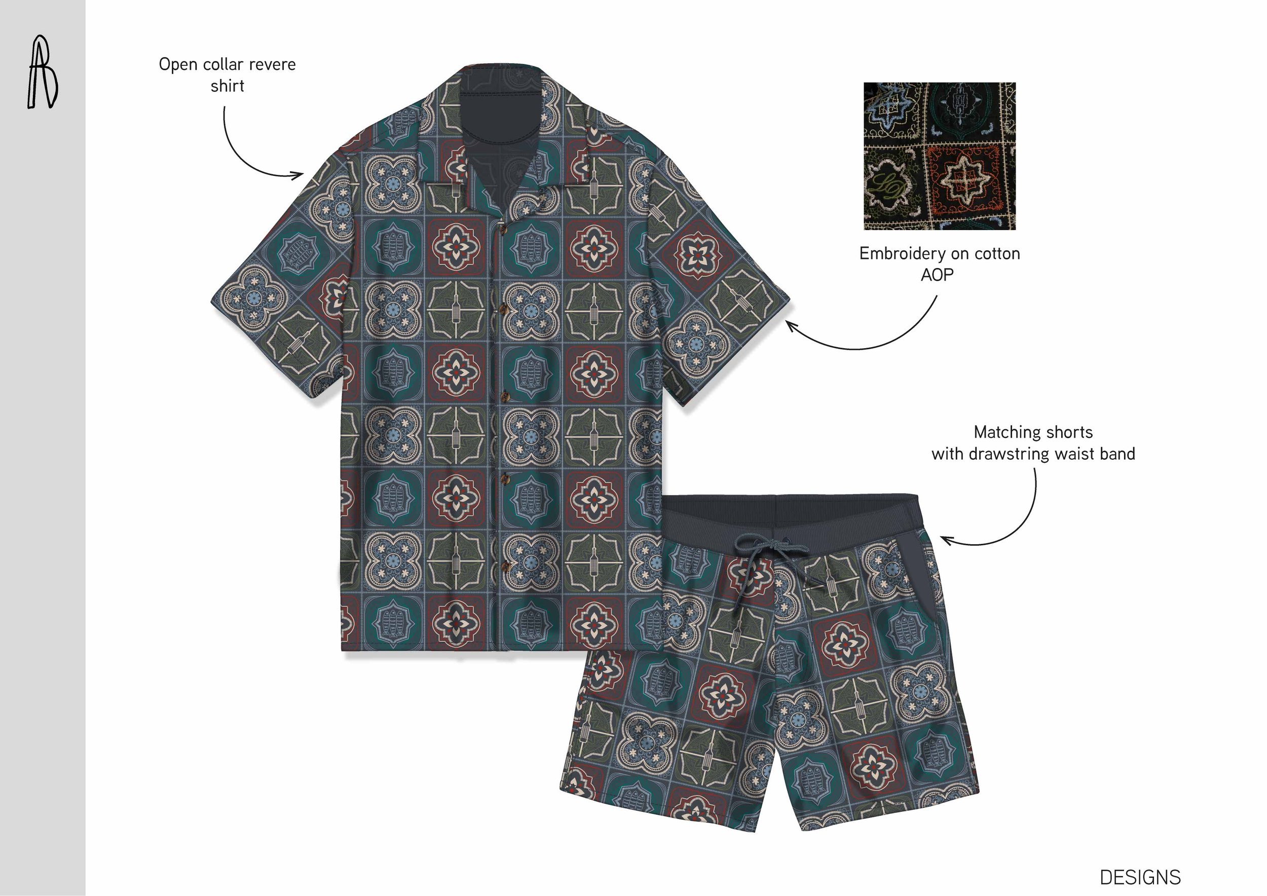
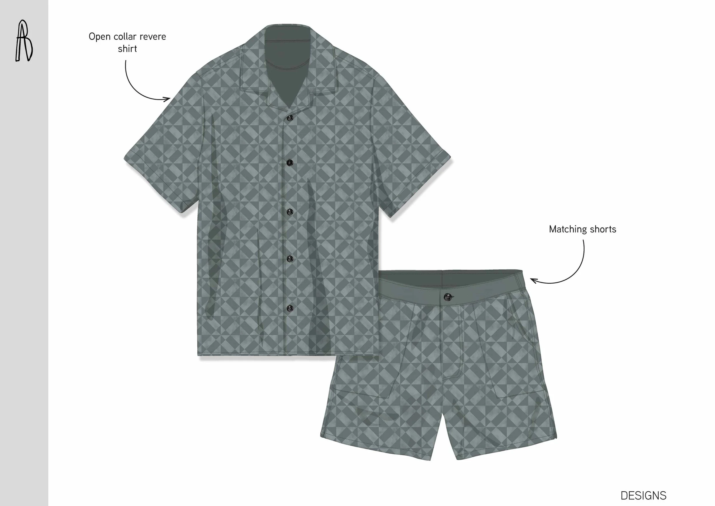
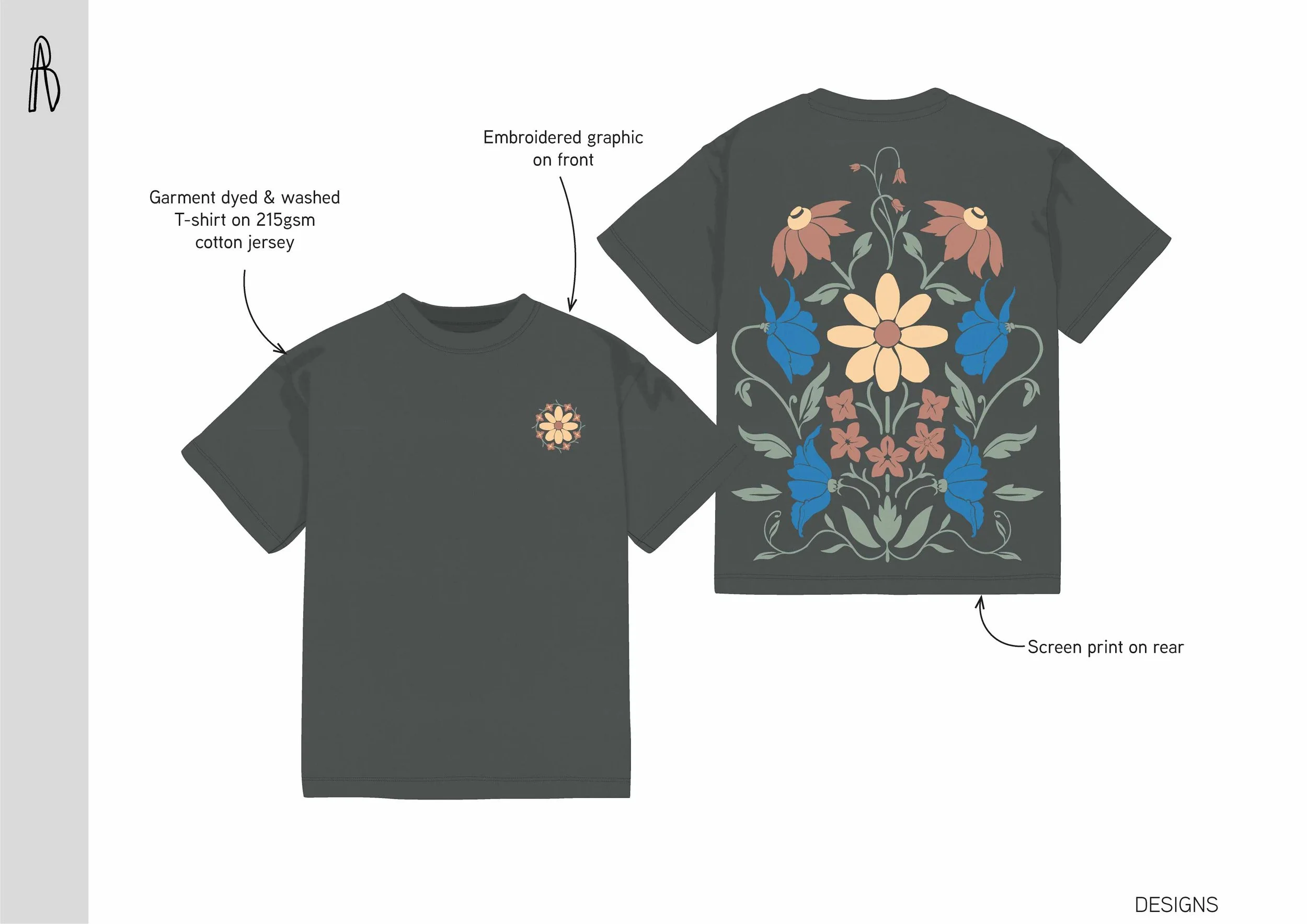
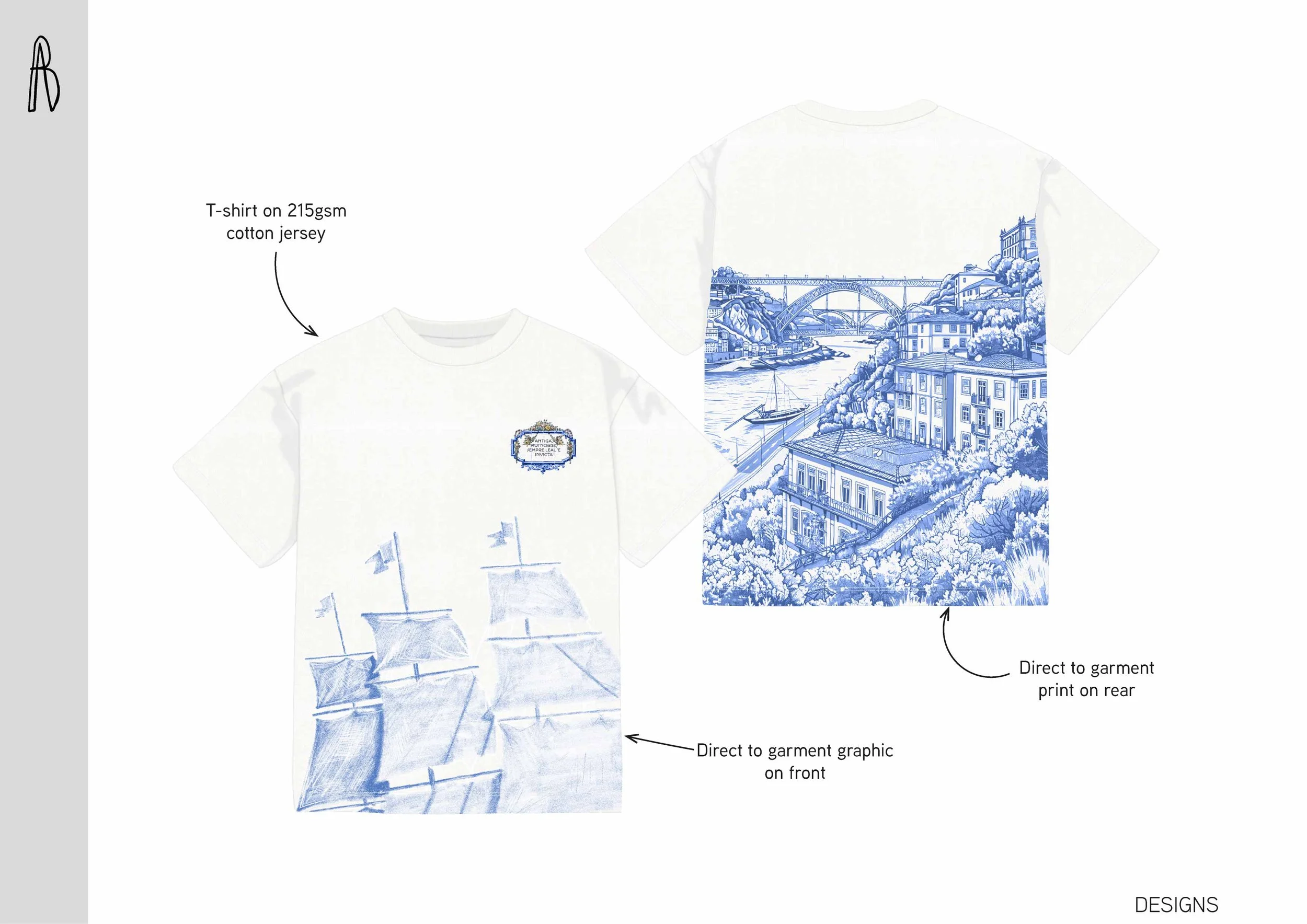
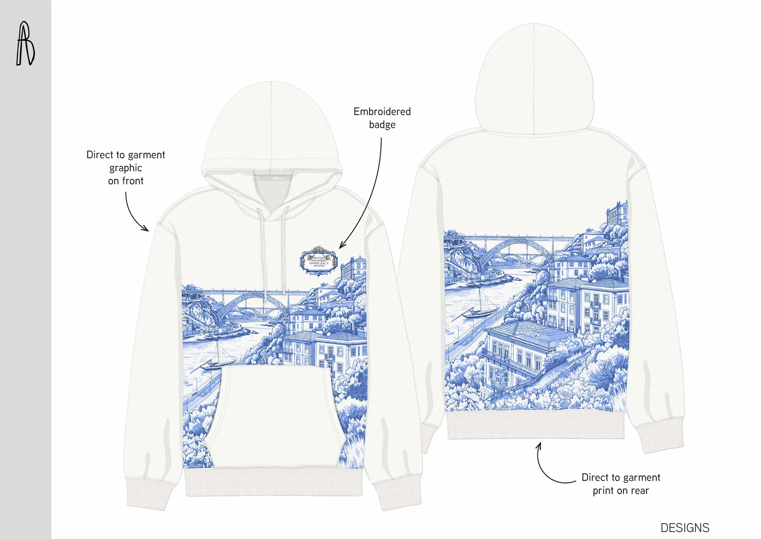
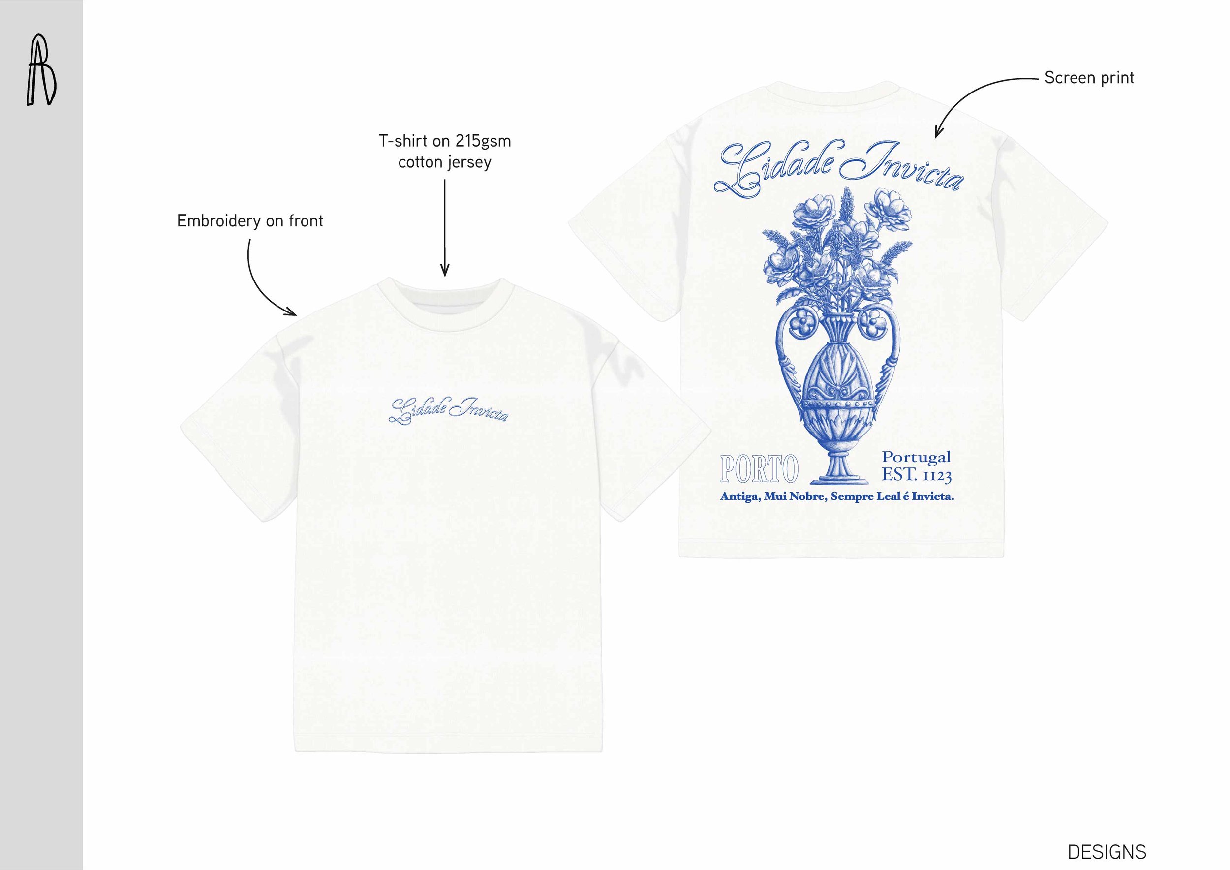
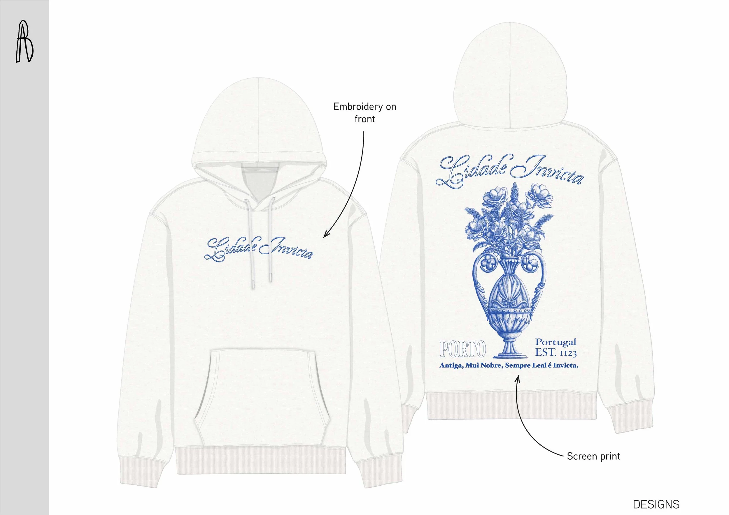
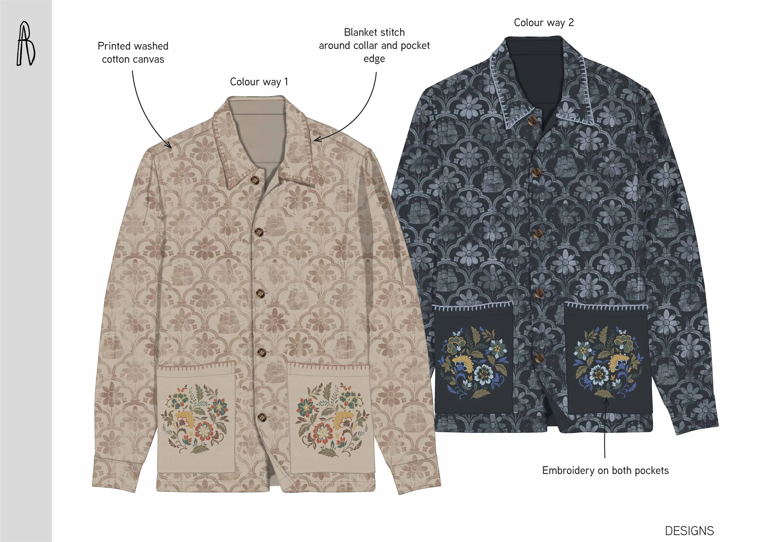
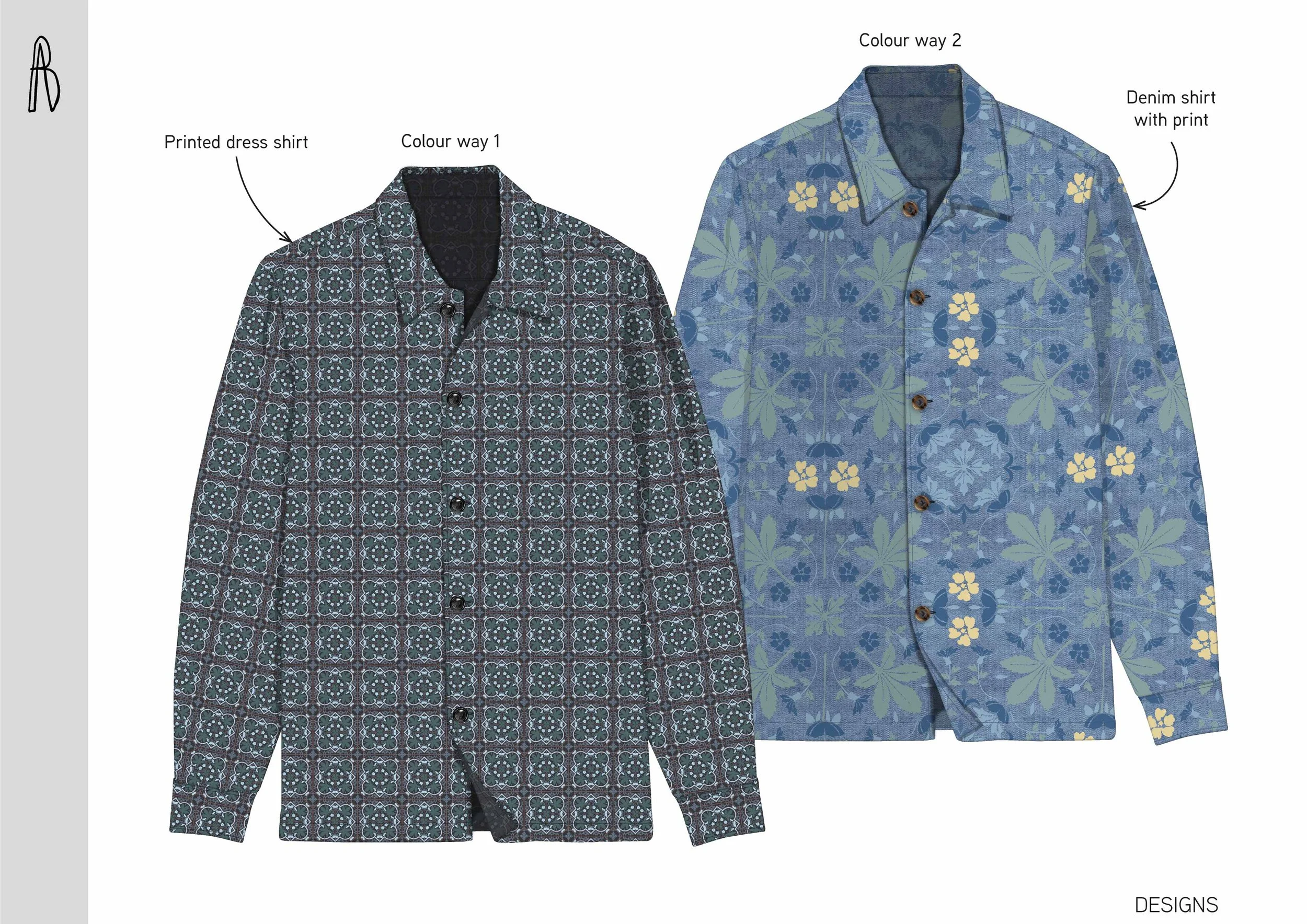
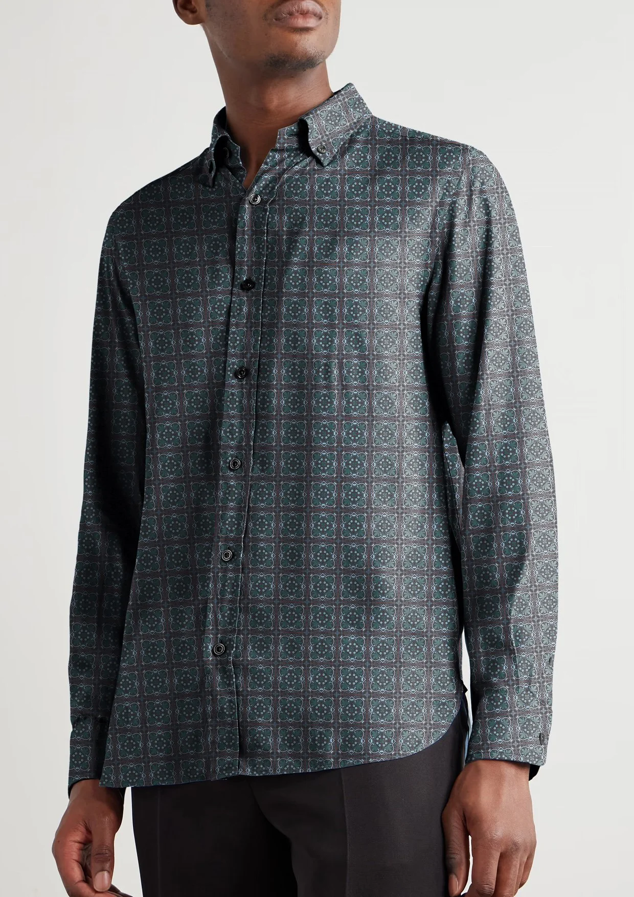
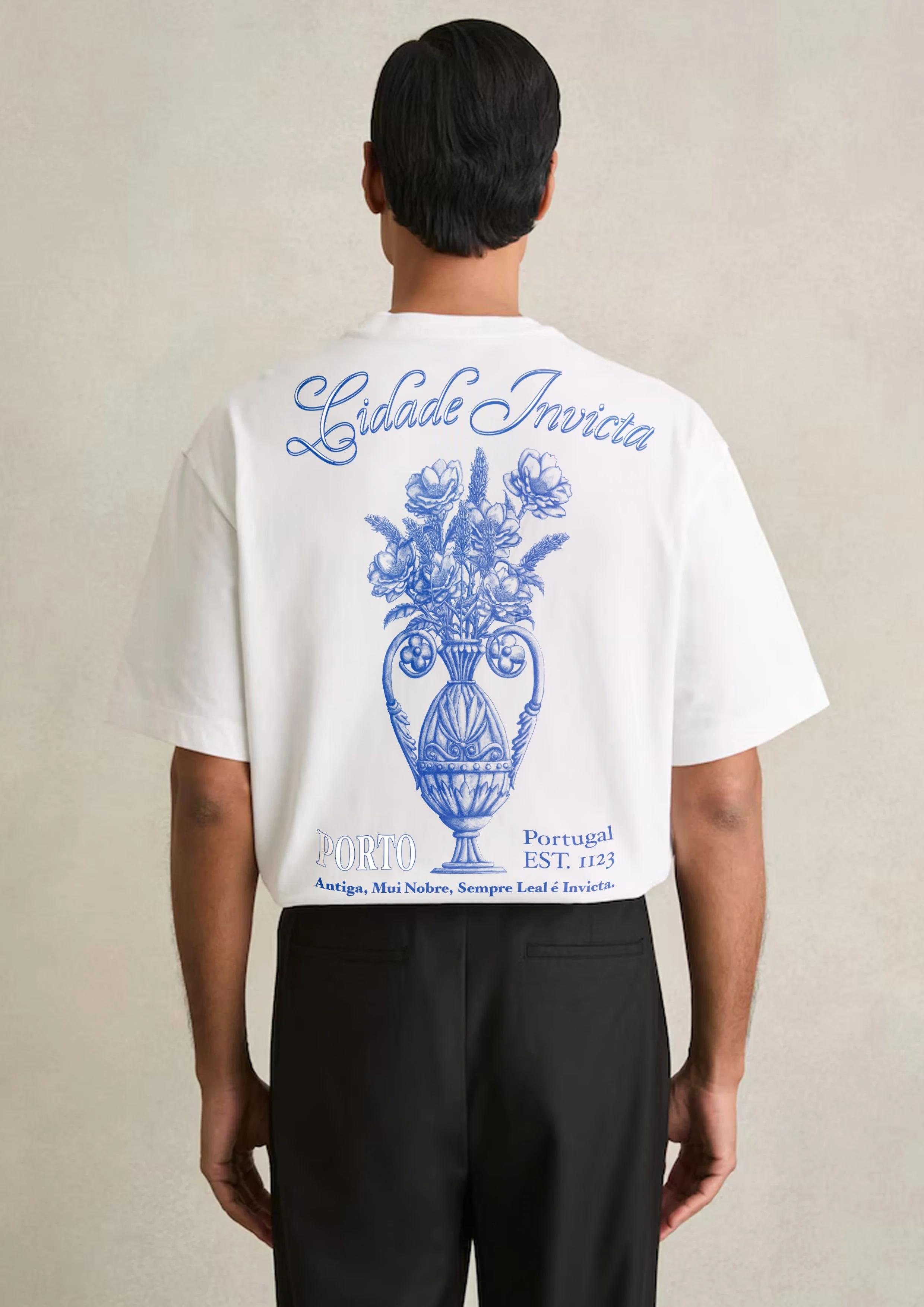
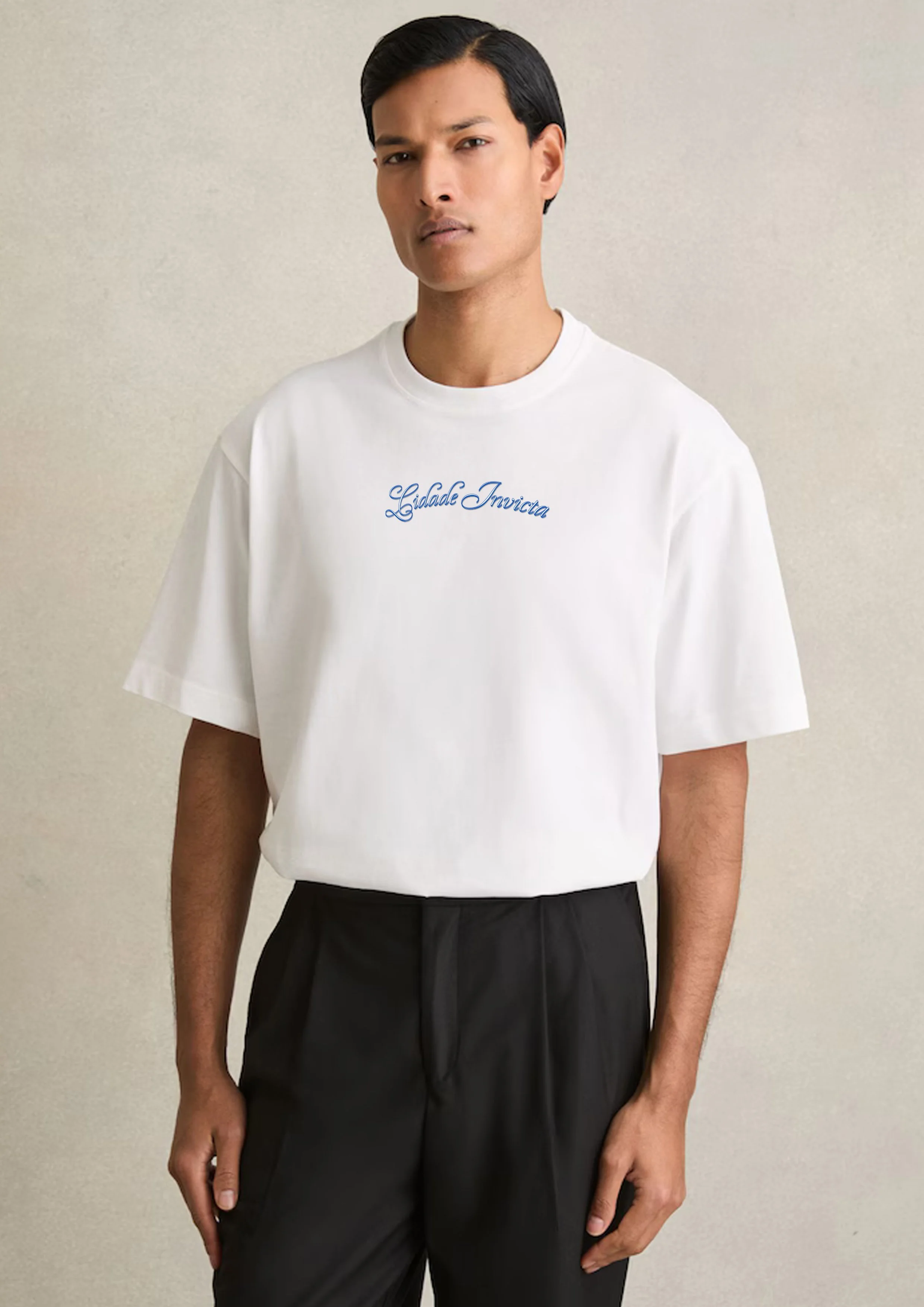
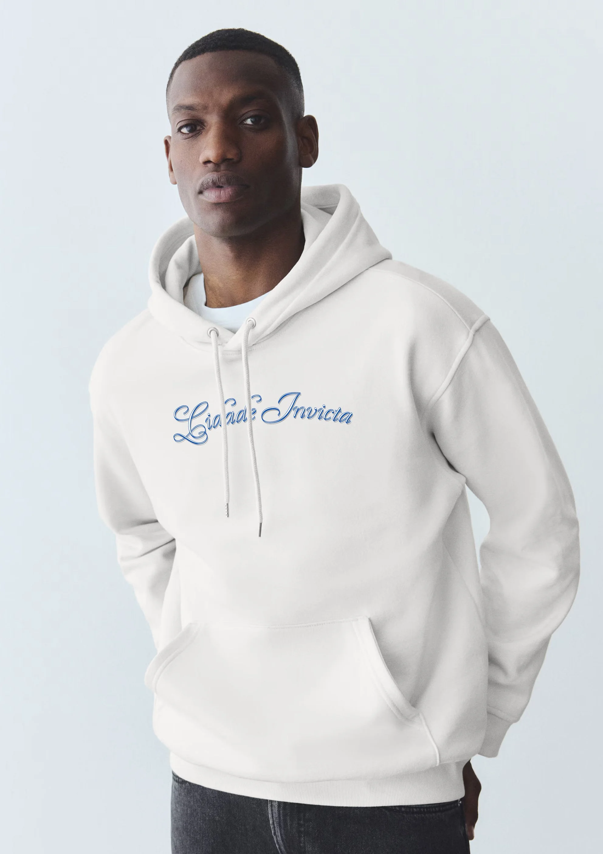
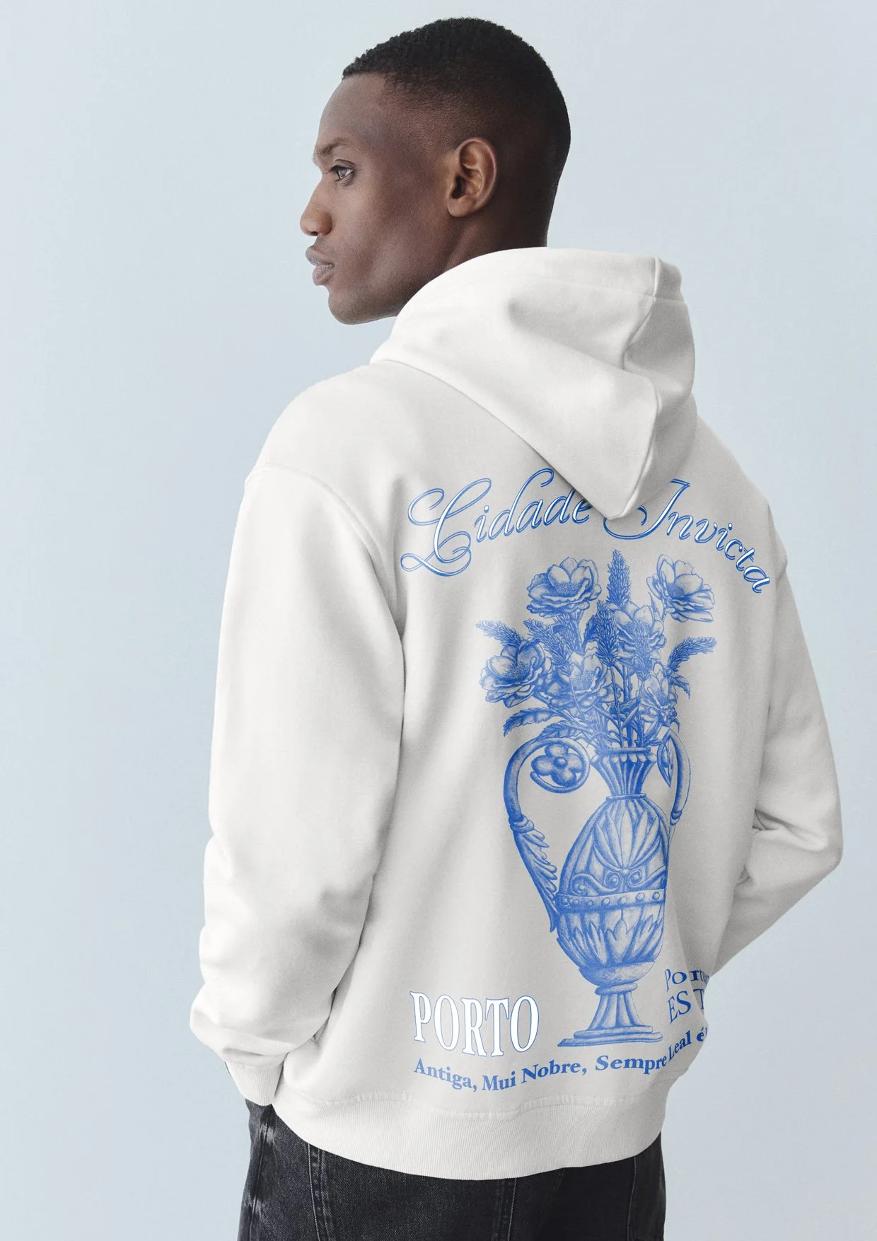
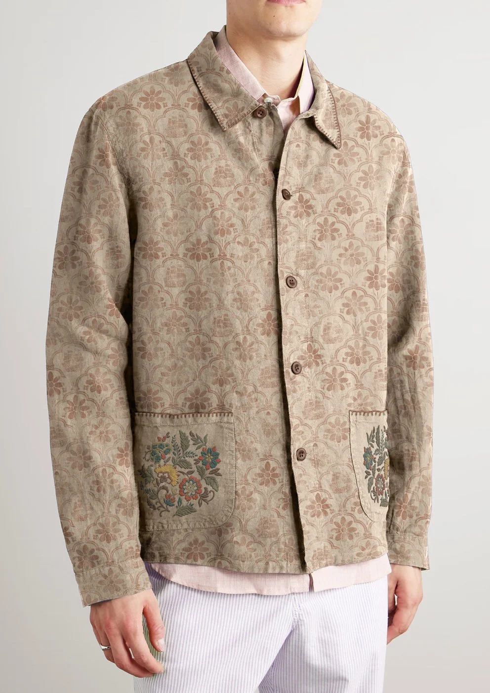
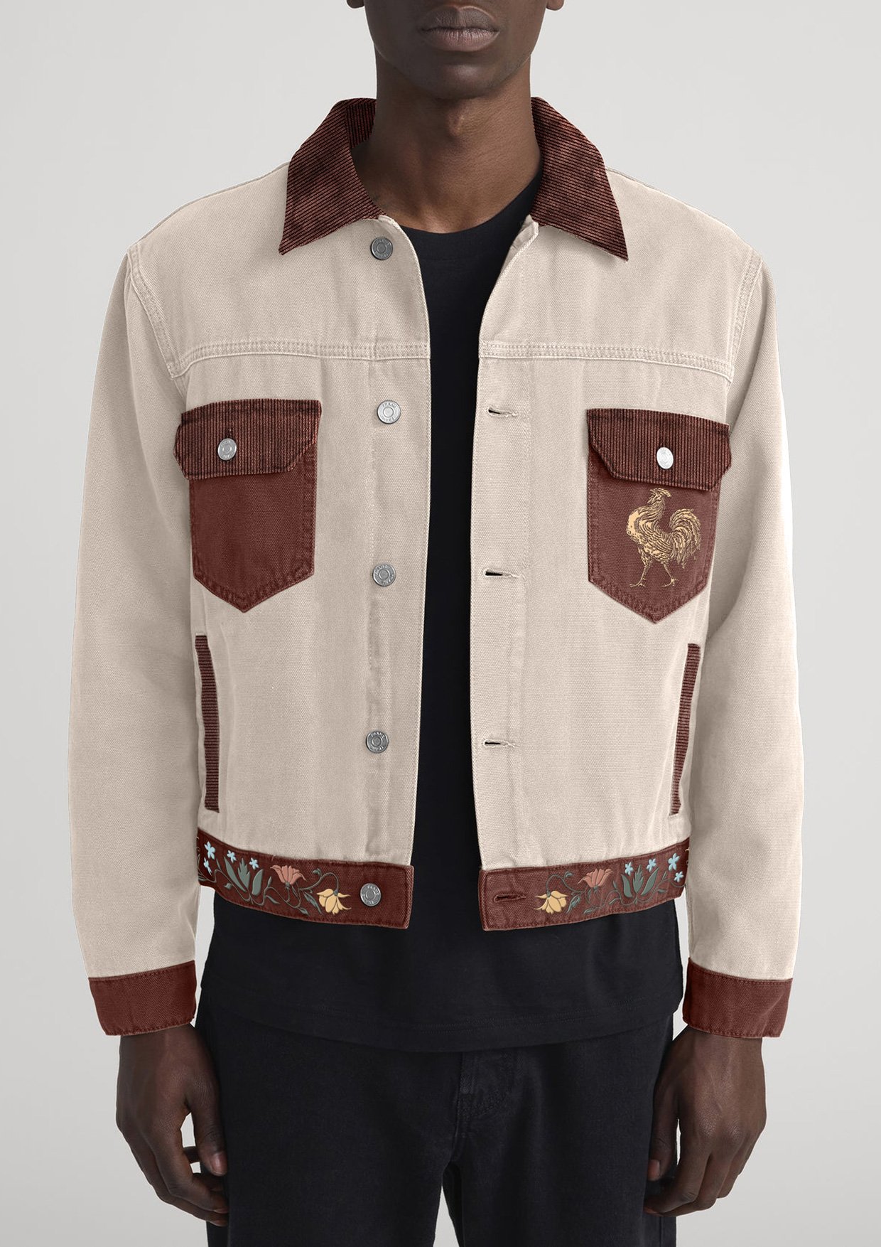
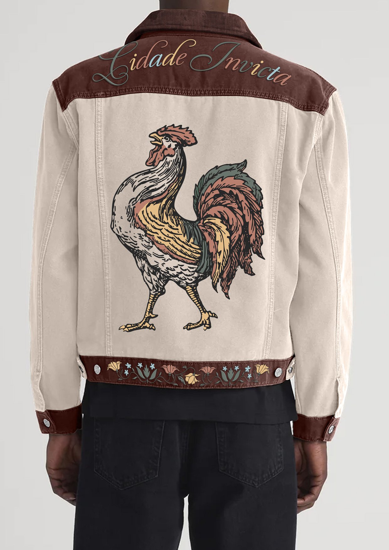
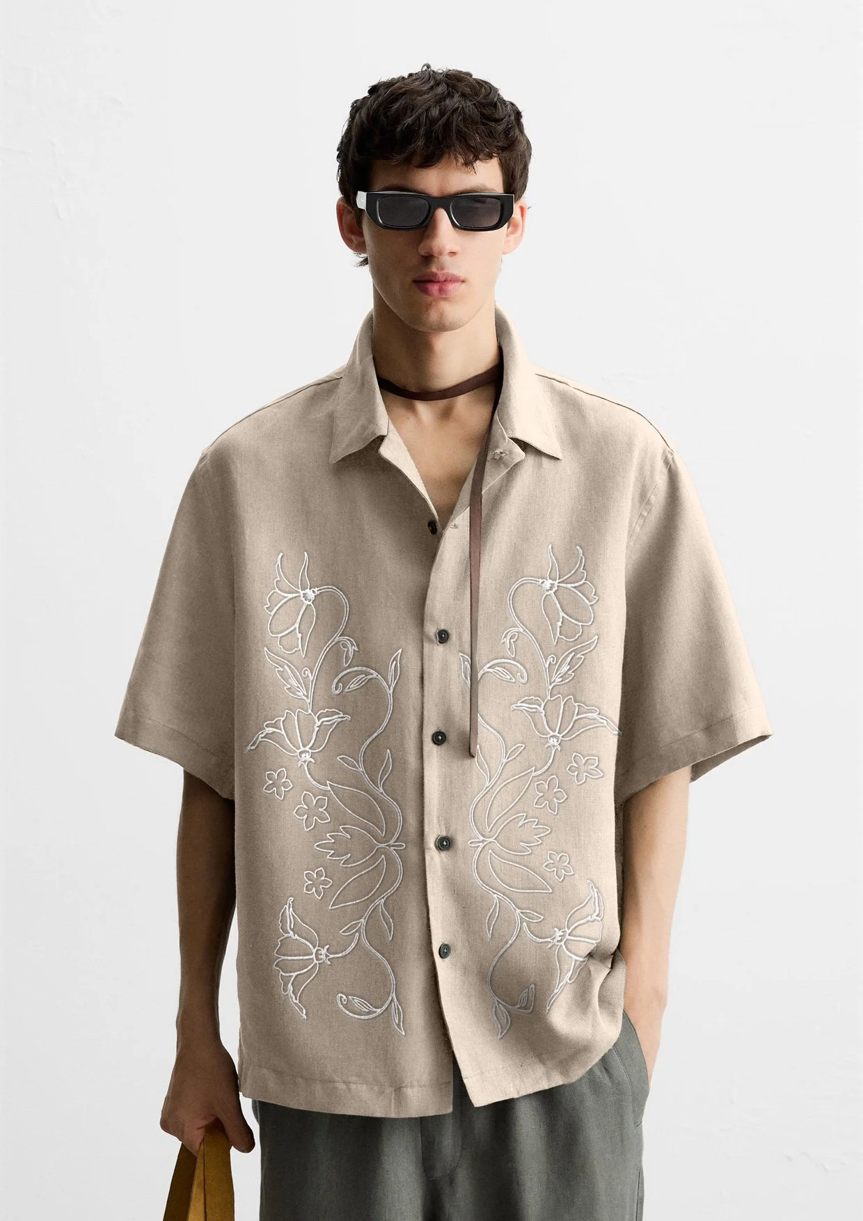
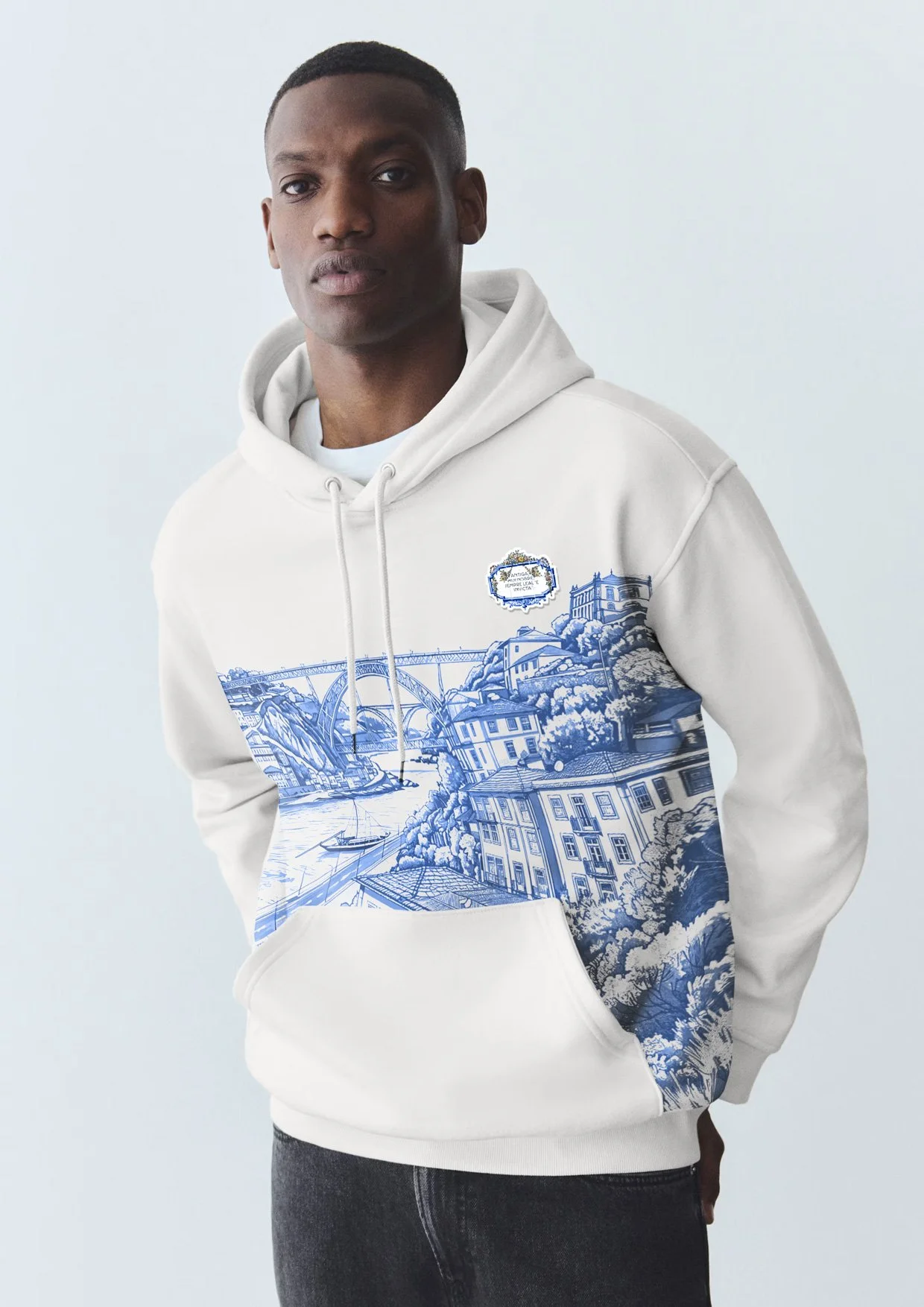
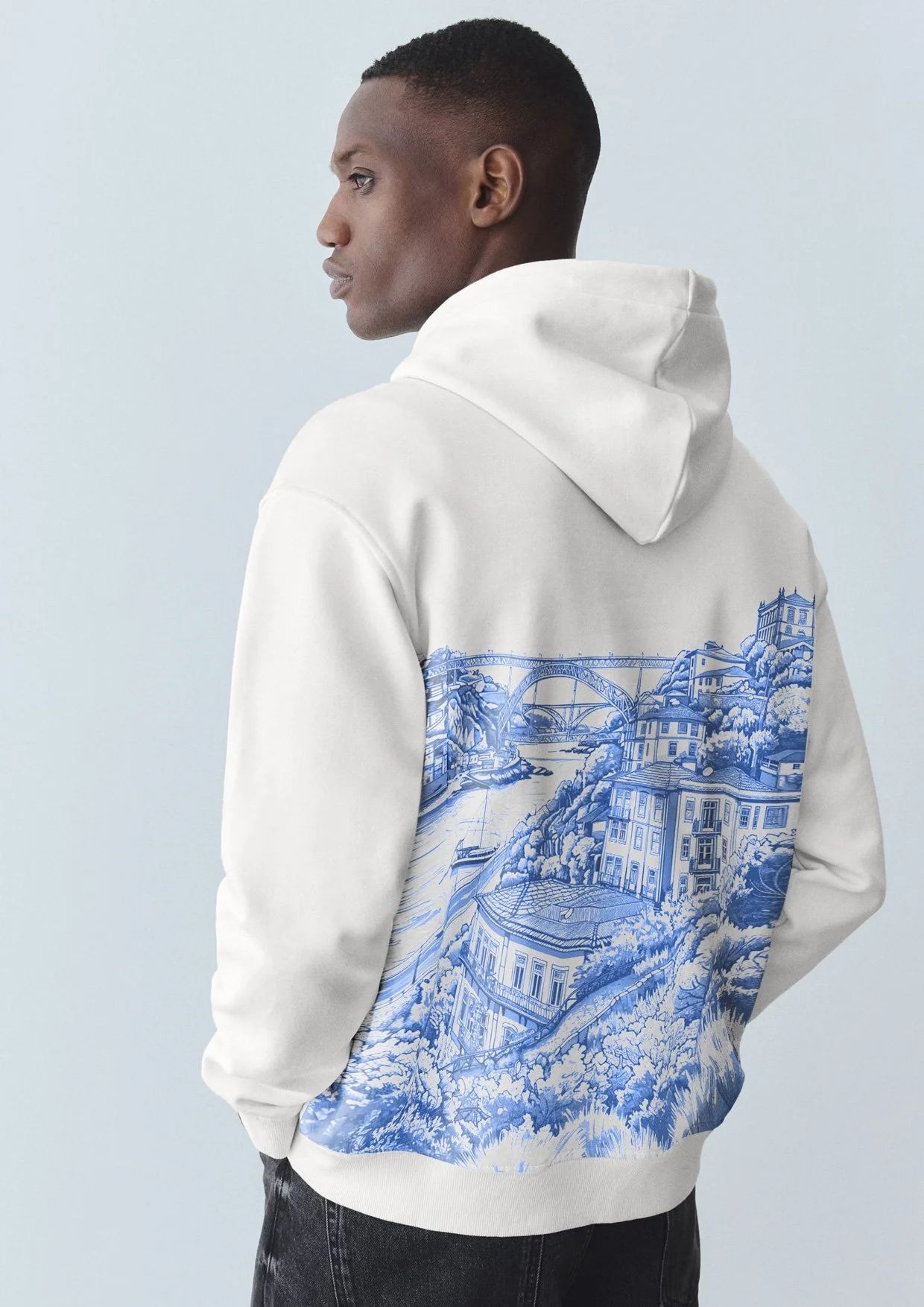
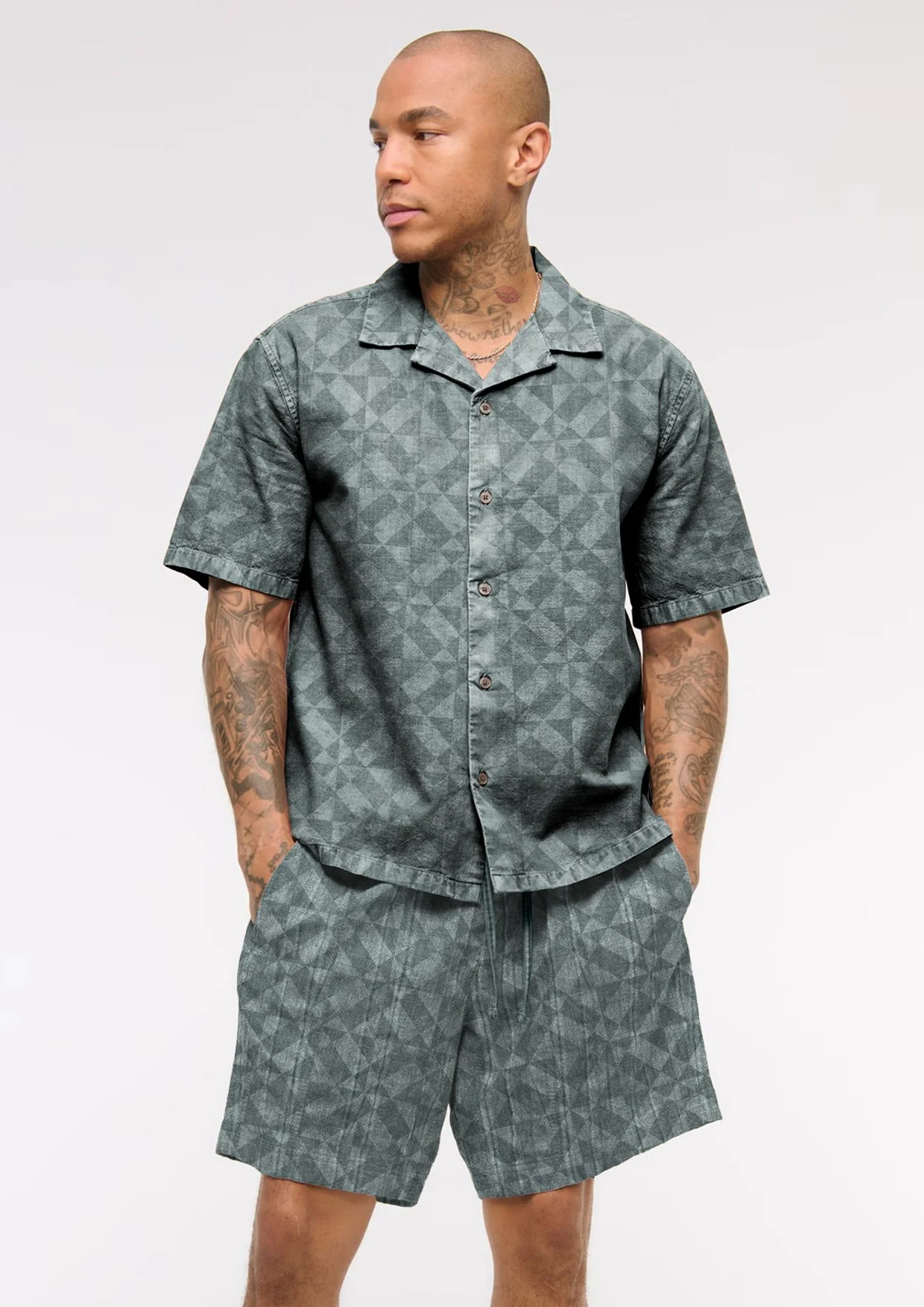
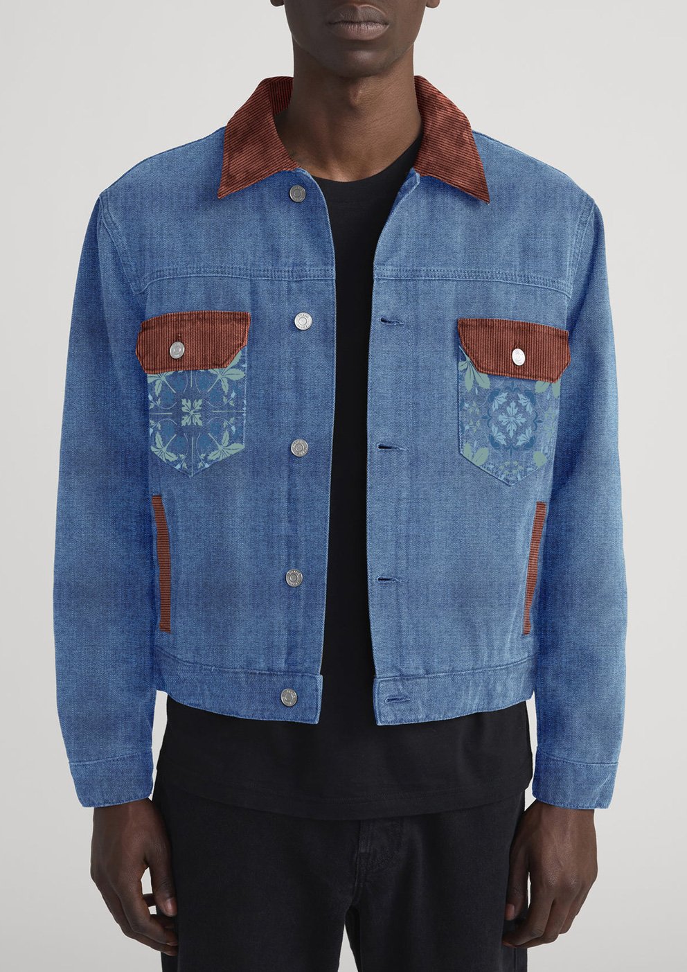
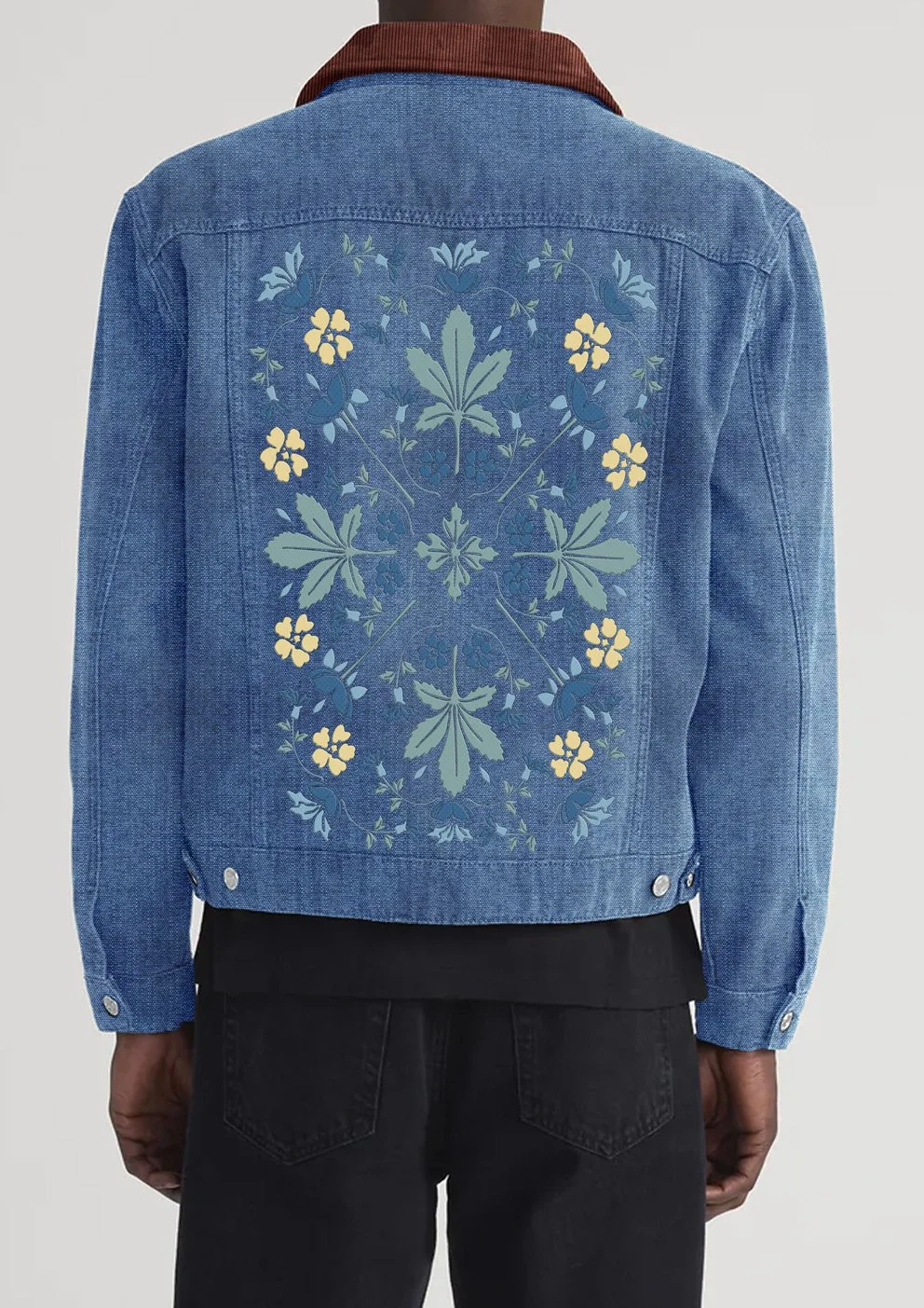
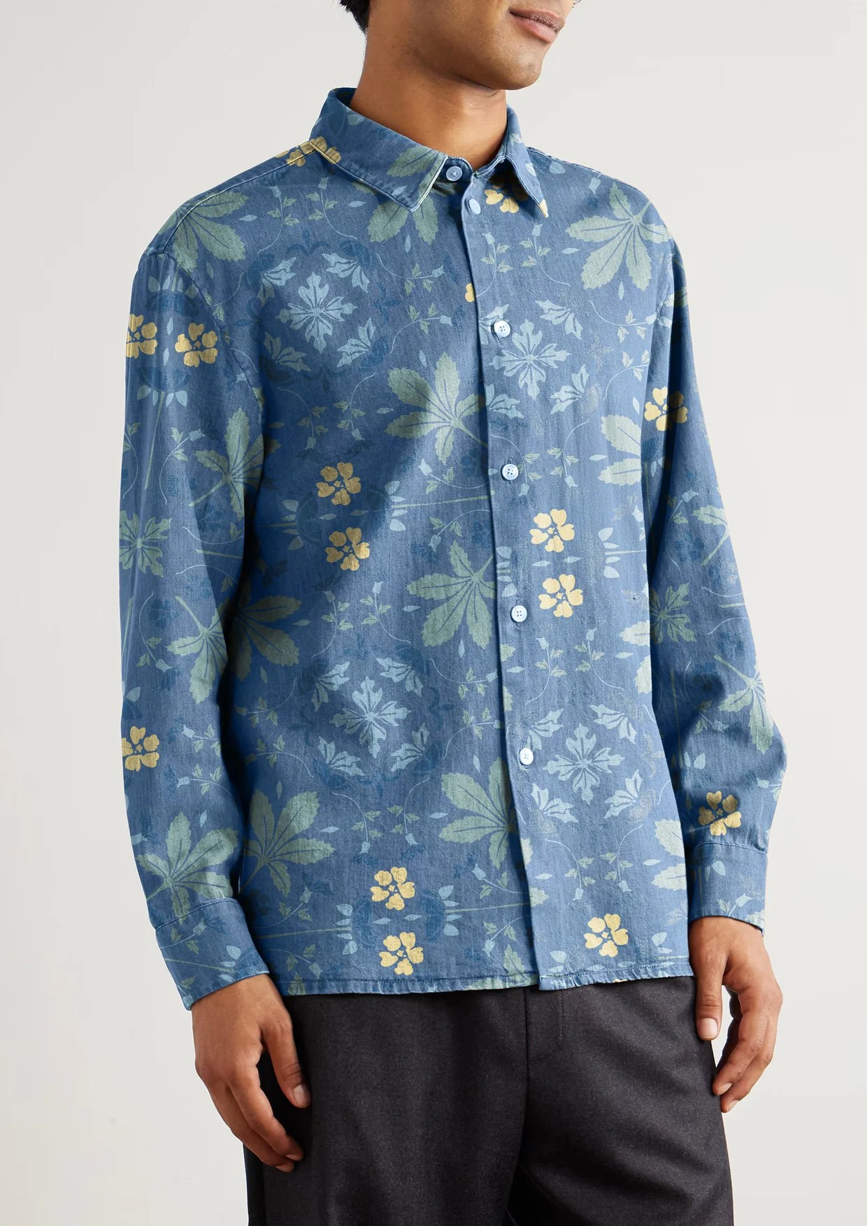
Prints and graphics applied across a cohesive menswear range including shirts, tees, hoodies, and coordinated sets. Placement, scale, and technique were considered to ensure clarity and balance across silhouettes.
Product designs
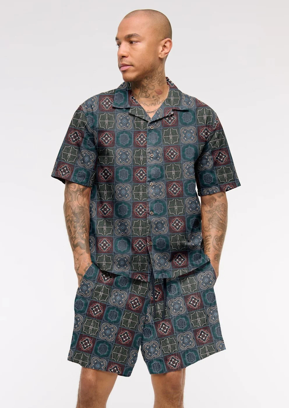
On-model applications
On-model visuals used to assess scale, placement, and wearability of prints and graphics across the menswear range.
This project demonstrates my approach to developing print-led menswear design stories, translating surface concepts into cohesive, wearable product outcomes.