
Menswear Spring Collection
Concept–Led Menswear Design Story
A concept-led Spring/Trans menswear collection, done as a project for a brand to show my thoughts on their design direction. The project explores where the brand should take its print & graphic concepts, where the brand should sit amongst its peers and trend driven menswear design.
The brief was to research into where the brand was historically (80s, 90s) and develop trend and print directions for a menswear range that shows layer-able items with a strong surface identity suitable for Spring/trans delivery.
Focus areas:
Trend design | Print & Graphic concepts | Silhouette development | Product design | Hand drawn sketches.
Featuring:
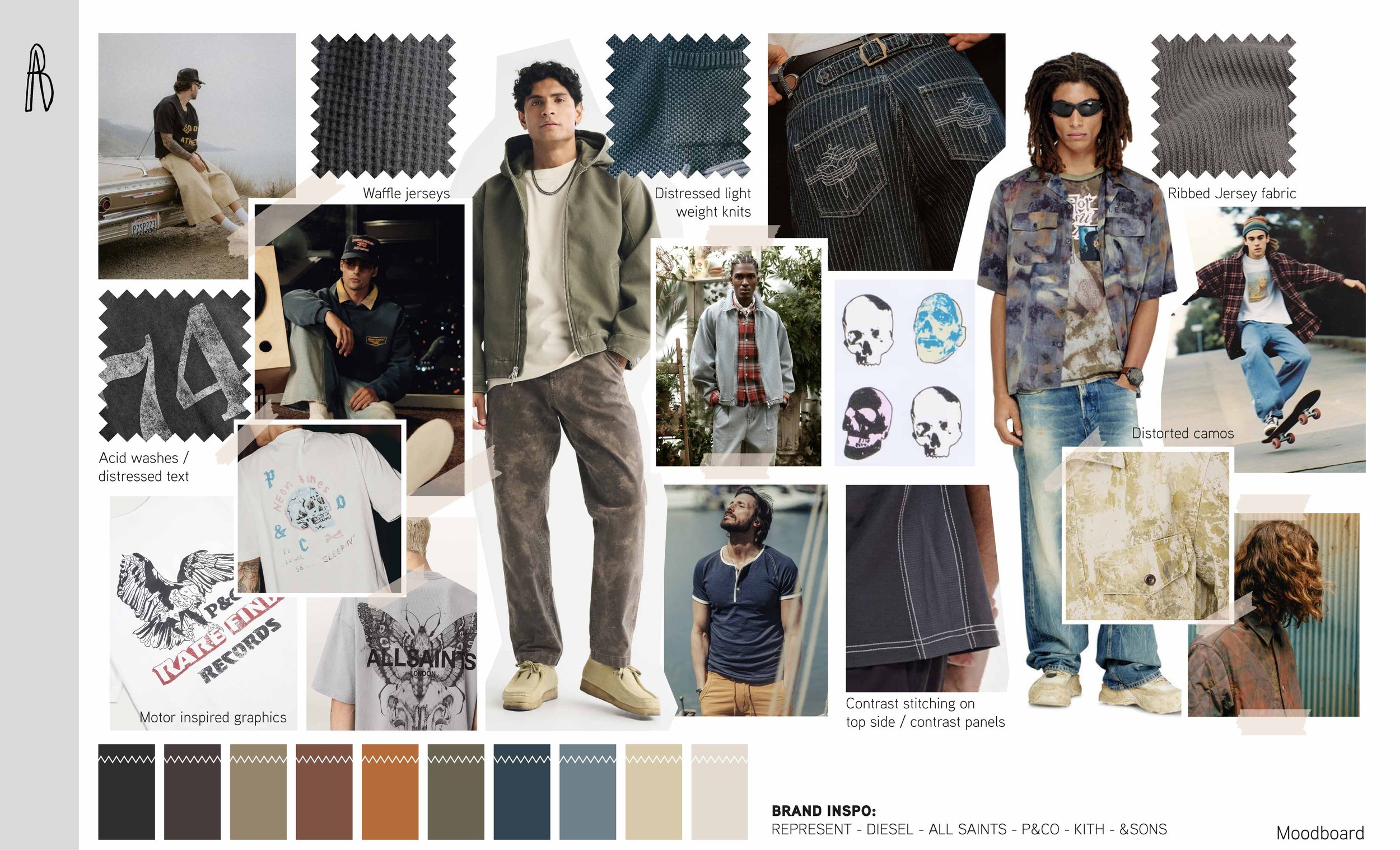
Mood Board
Visual research focused on the brands historic past, its future direction, and inspirational brands.
A tonal earth inspired pallete, developed to support the concept of layering outerwear with denim fabrics.
Color palette
#232222
#473c3a
#96856b
#7e5344
#d8cbab
#b56b39
#696450
#324651
#6d808b
#ECE6DD
Research for the brands graphic direction and different applications that will improve their aesthetic.
Prints & GRAPHICS
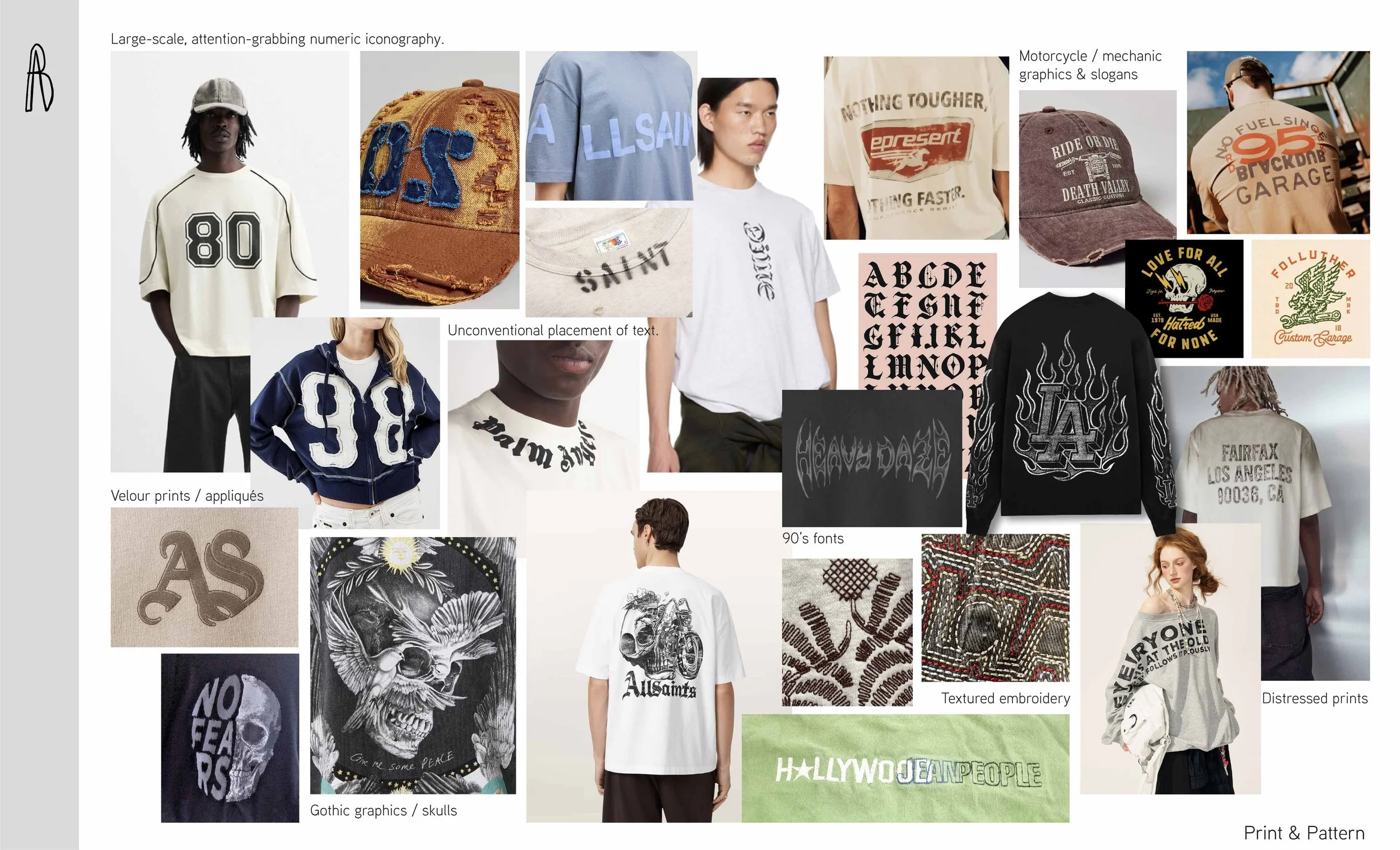
Visual research focused print, graphics and application.
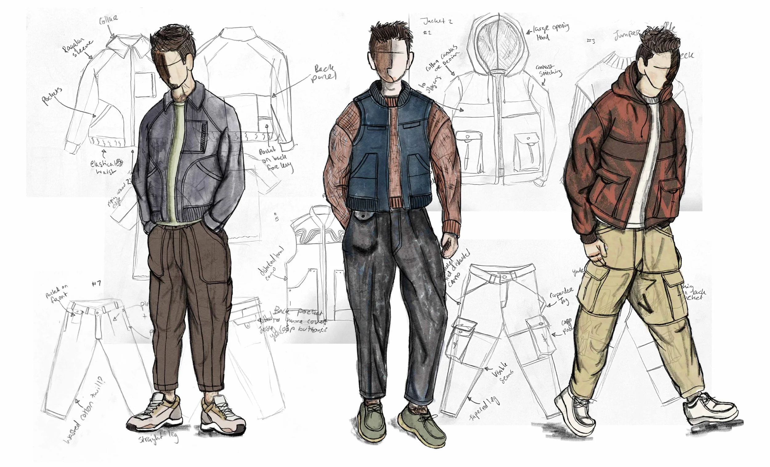
Hand drawn sketches combined with drawings on my iPad to show overall concept.
Initial sketches
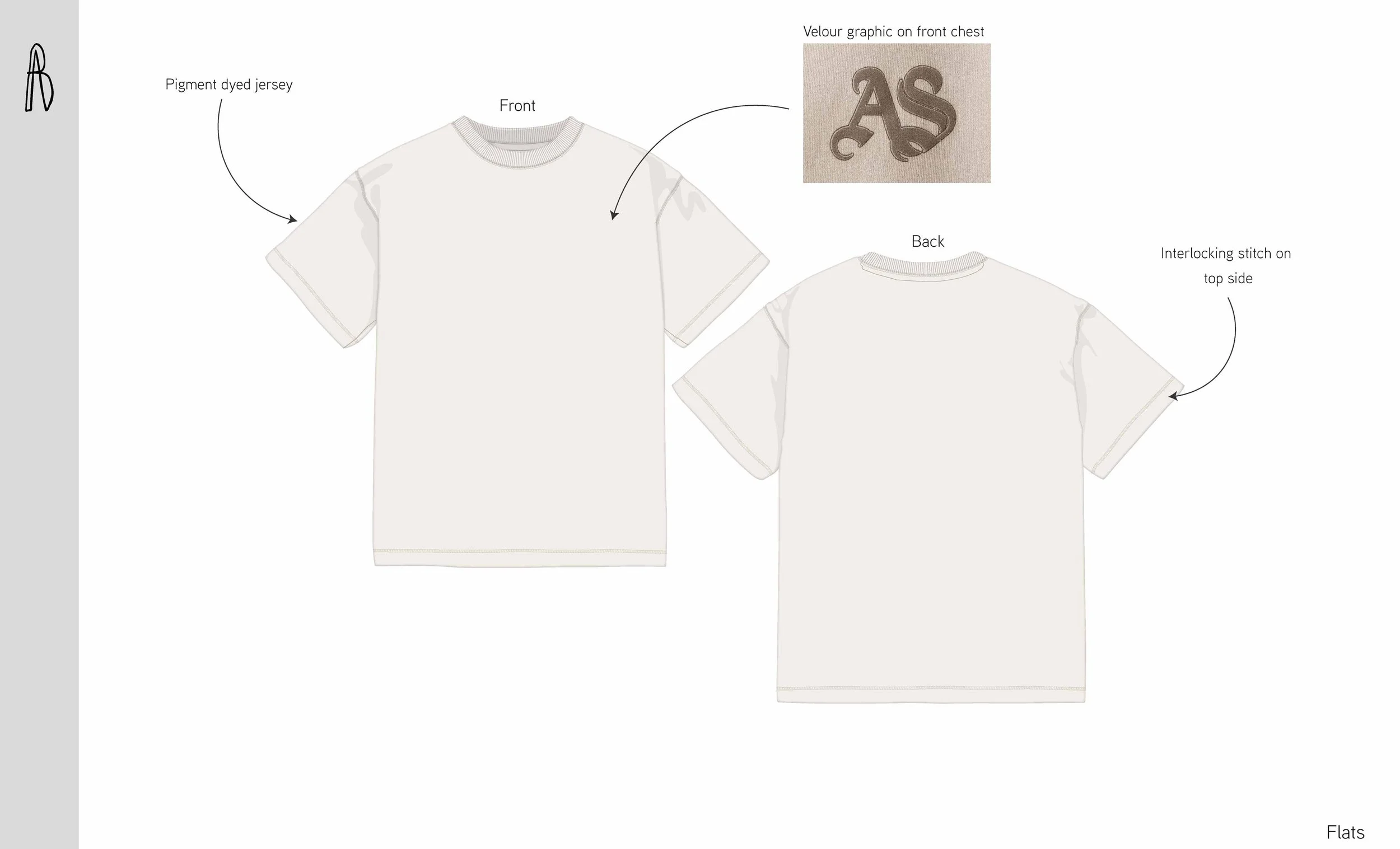
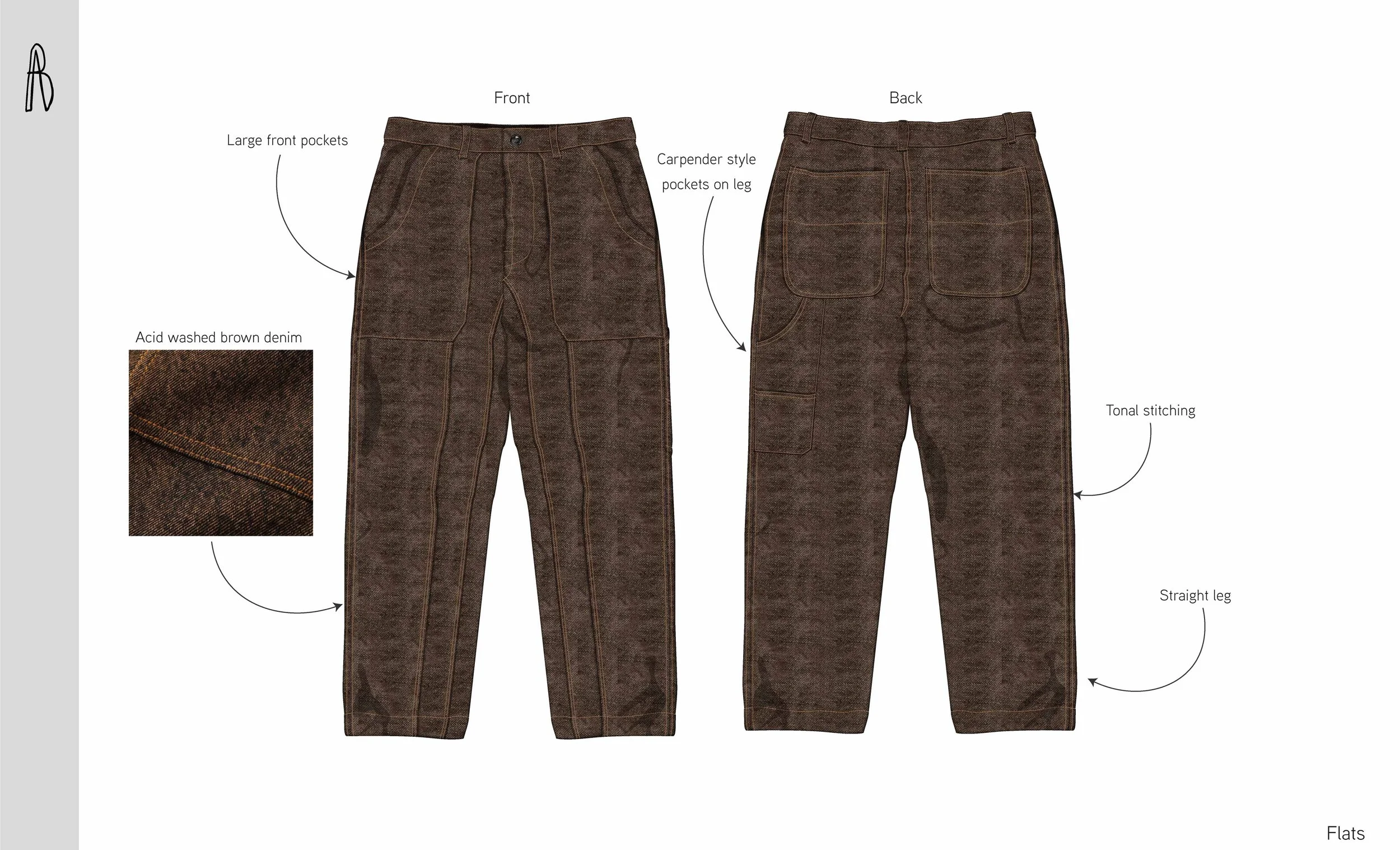
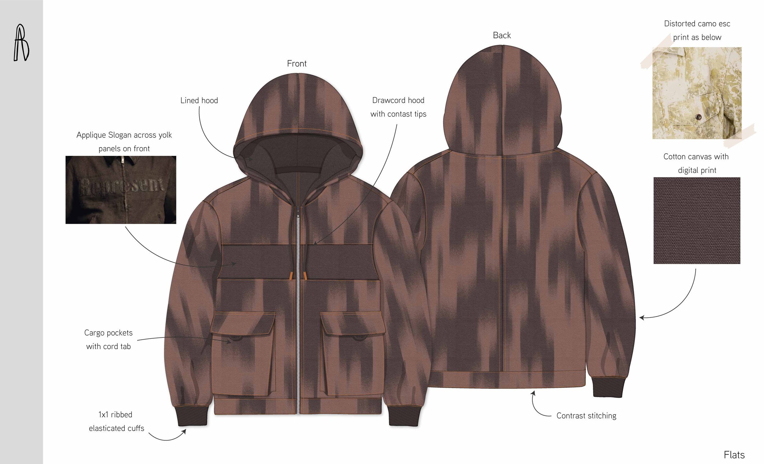
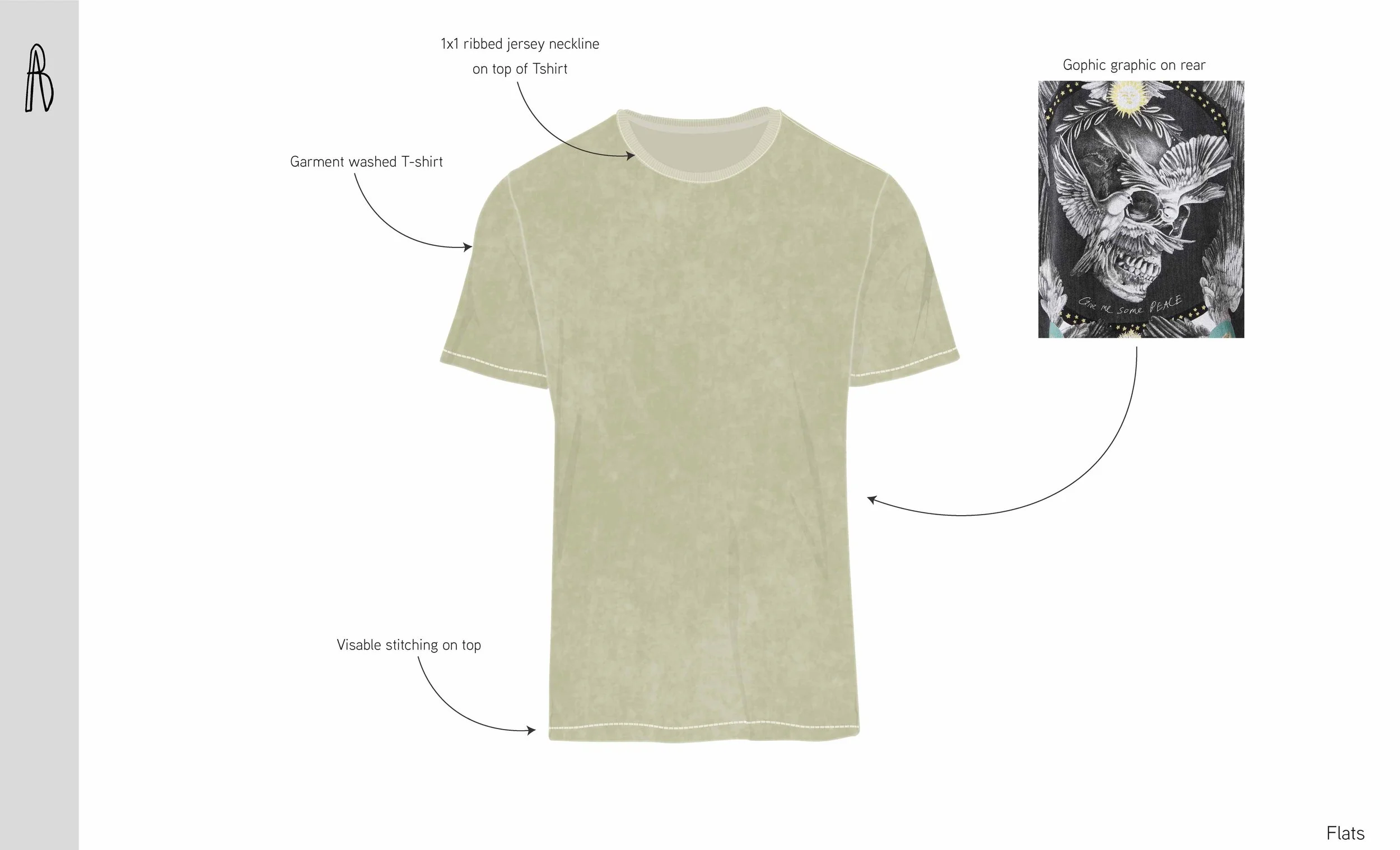
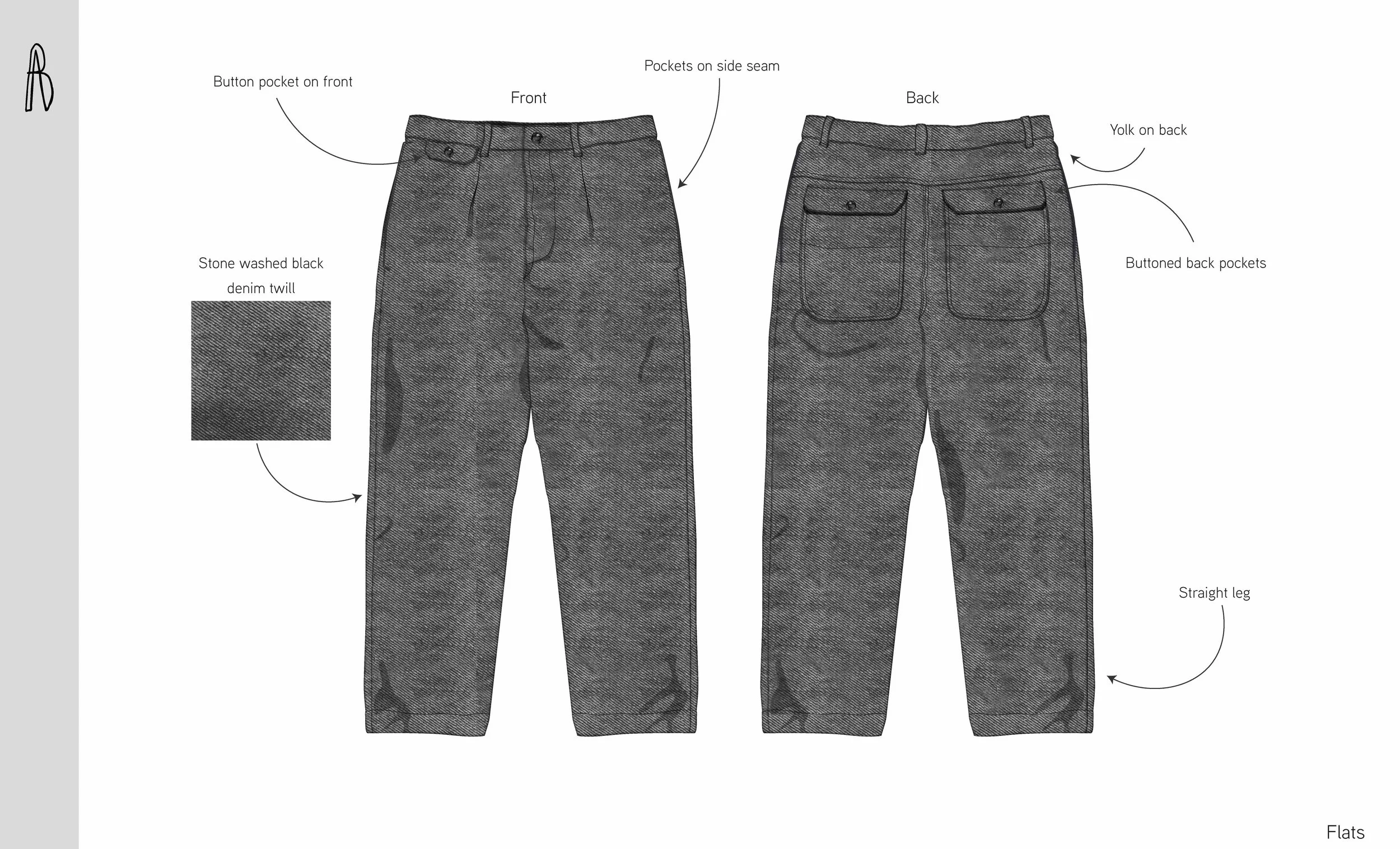
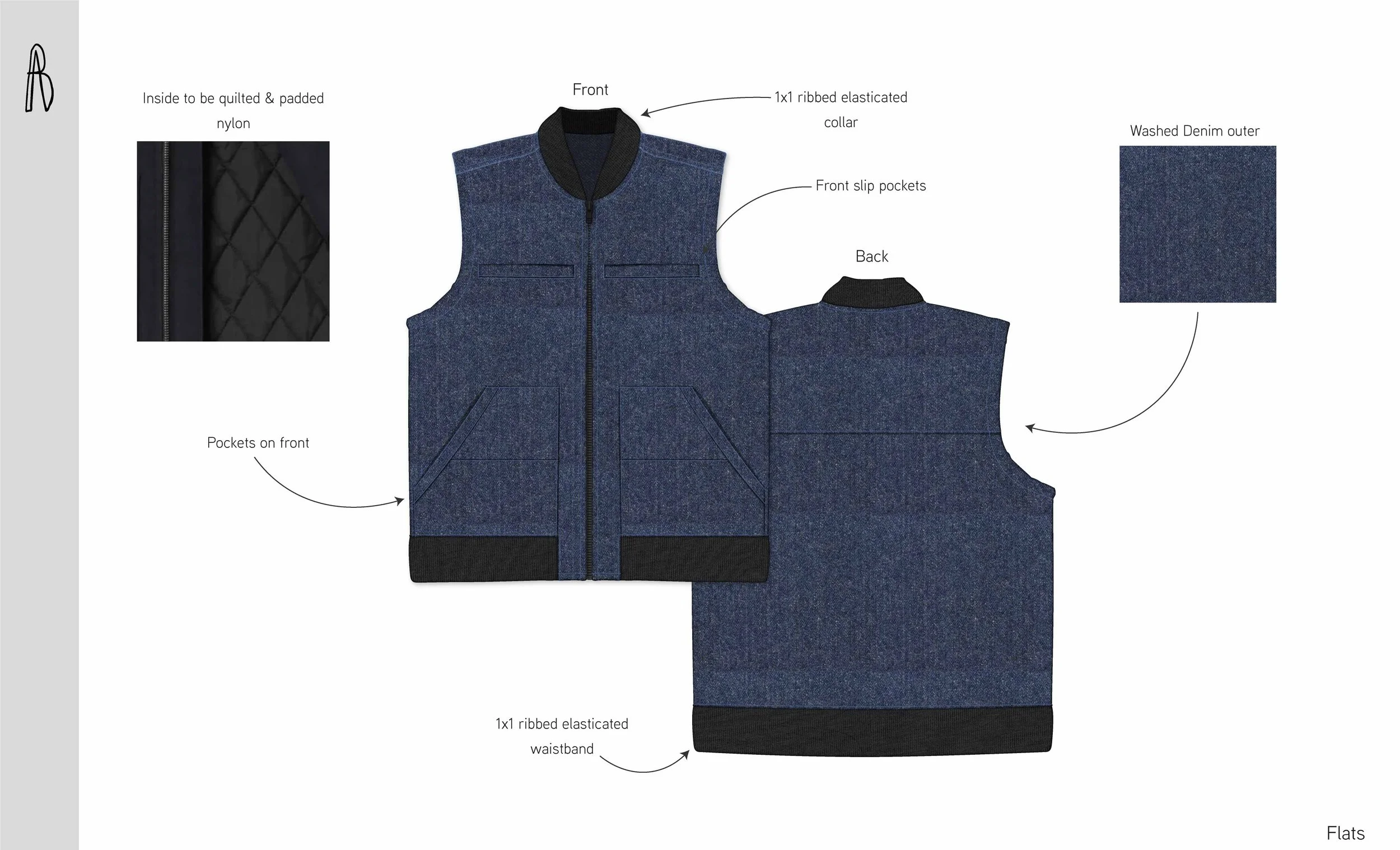
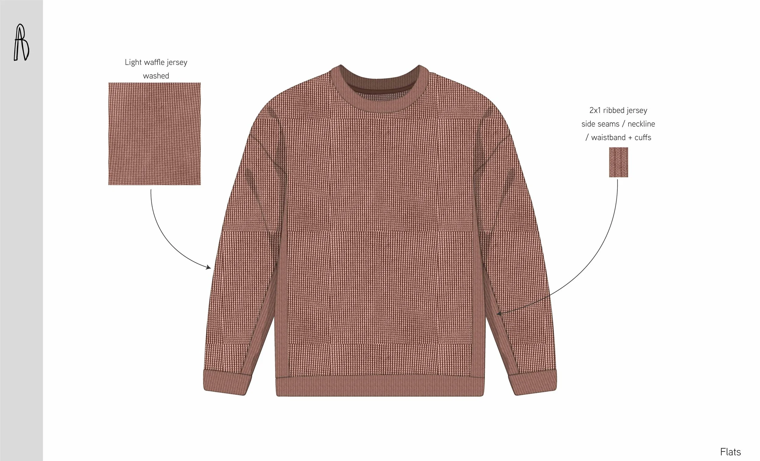
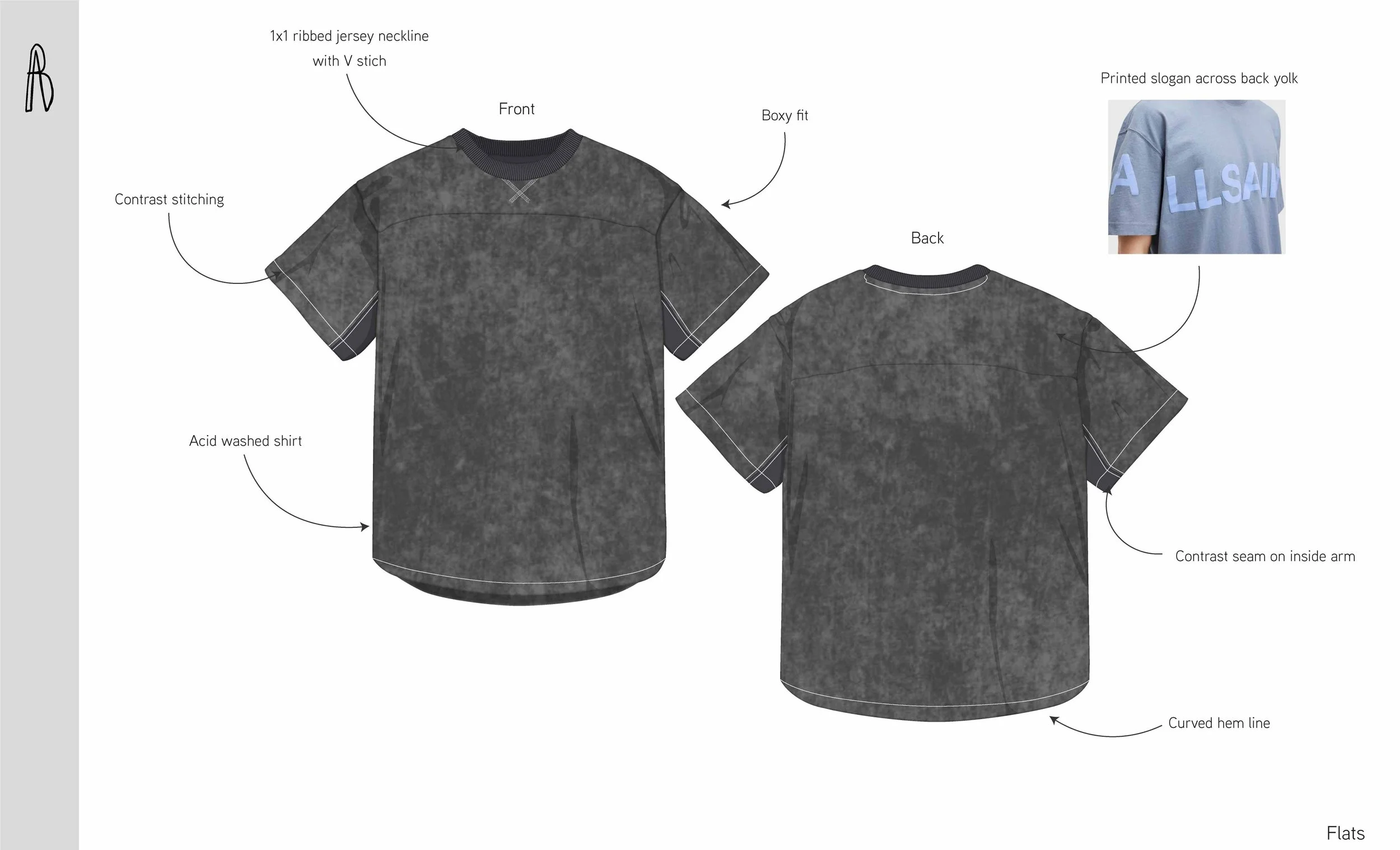
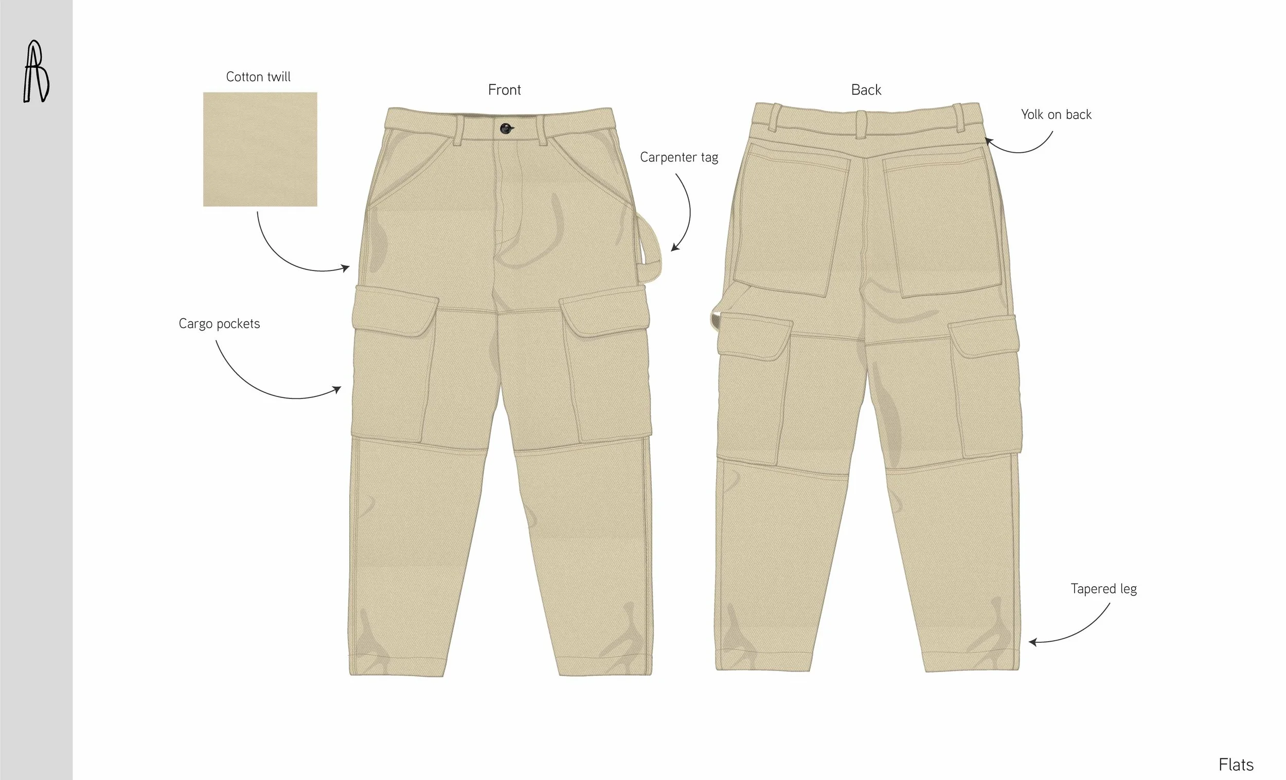
Prints and graphics applied across a cohesive menswear range including shirts, tees, hoodies, and coordinated sets. Placement, scale, and technique were considered to ensure clarity and balance across silhouettes.
Product designs
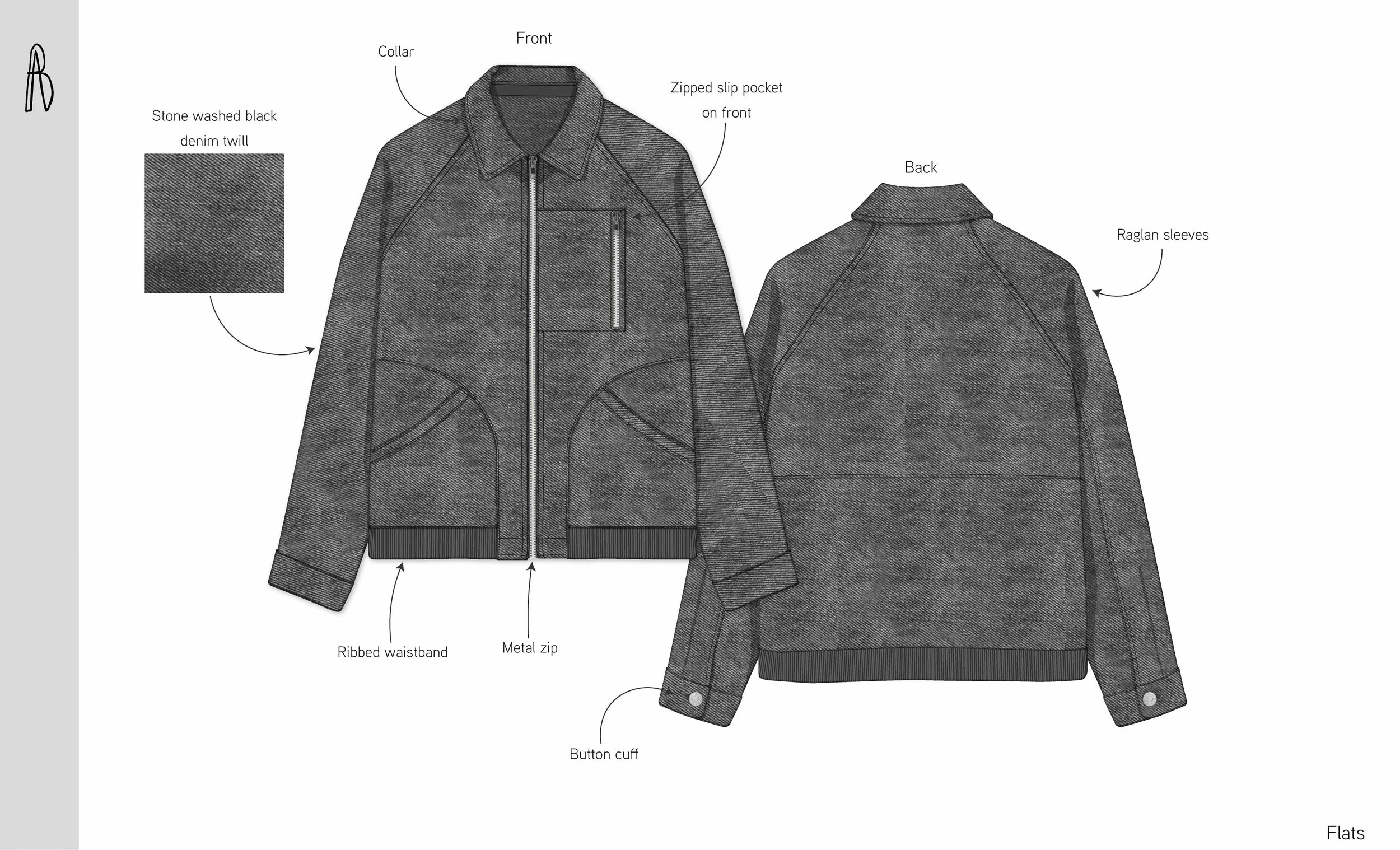
This project demonstrates my approach to developing print-led menswear design stories, translating surface concepts into cohesive, wearable product outcomes.