
Luton town FC — 2028 Concept collection
Football Apparel & Sportswear Design Story
Luton Town FC is my hometown club, the team I grew up supporting and the reason football (soccer) has always been personal to me. This project imagines a future collection for the Hatters, bringing together that lifelong connection with my experience in apparel, print and graphic design.
Rather than simply redesigning the shirt, I wanted to explore what Luton looks and feels like as a complete football brand - translating the club’s history, Kenilworth Road, the town’s industrial heritage and supporter identity into contemporary matchday, training and lifestyle product.
Focus areas:
Football Apparel Design | Kit Design | Sportswear Graphics | Performance Product | Fanwear & Lifestyle | Licensed Product | Technical CAD Development
Featuring:
Additions to the project coming soon, including Fan and Training Collections.
Mood Boards
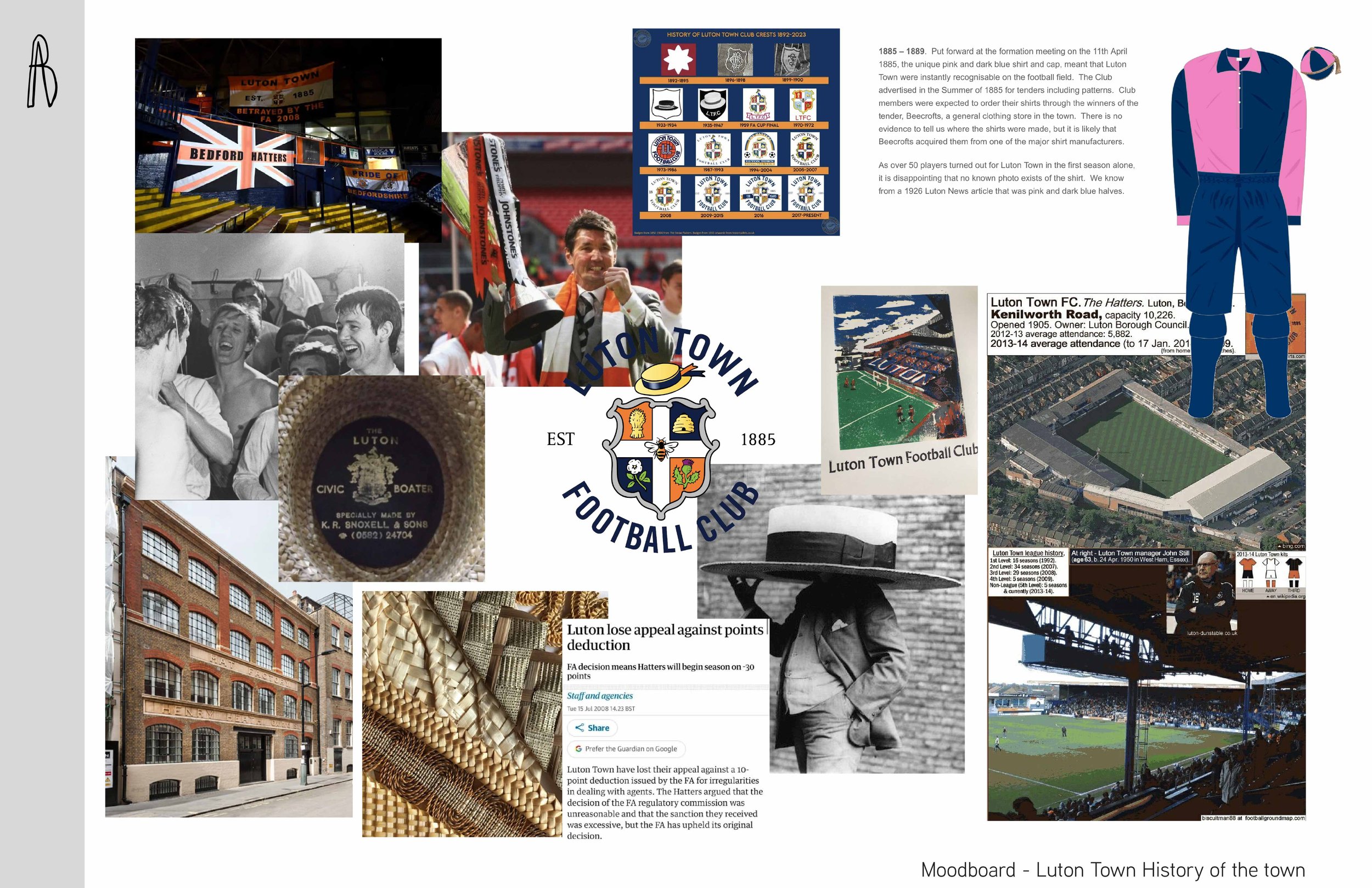
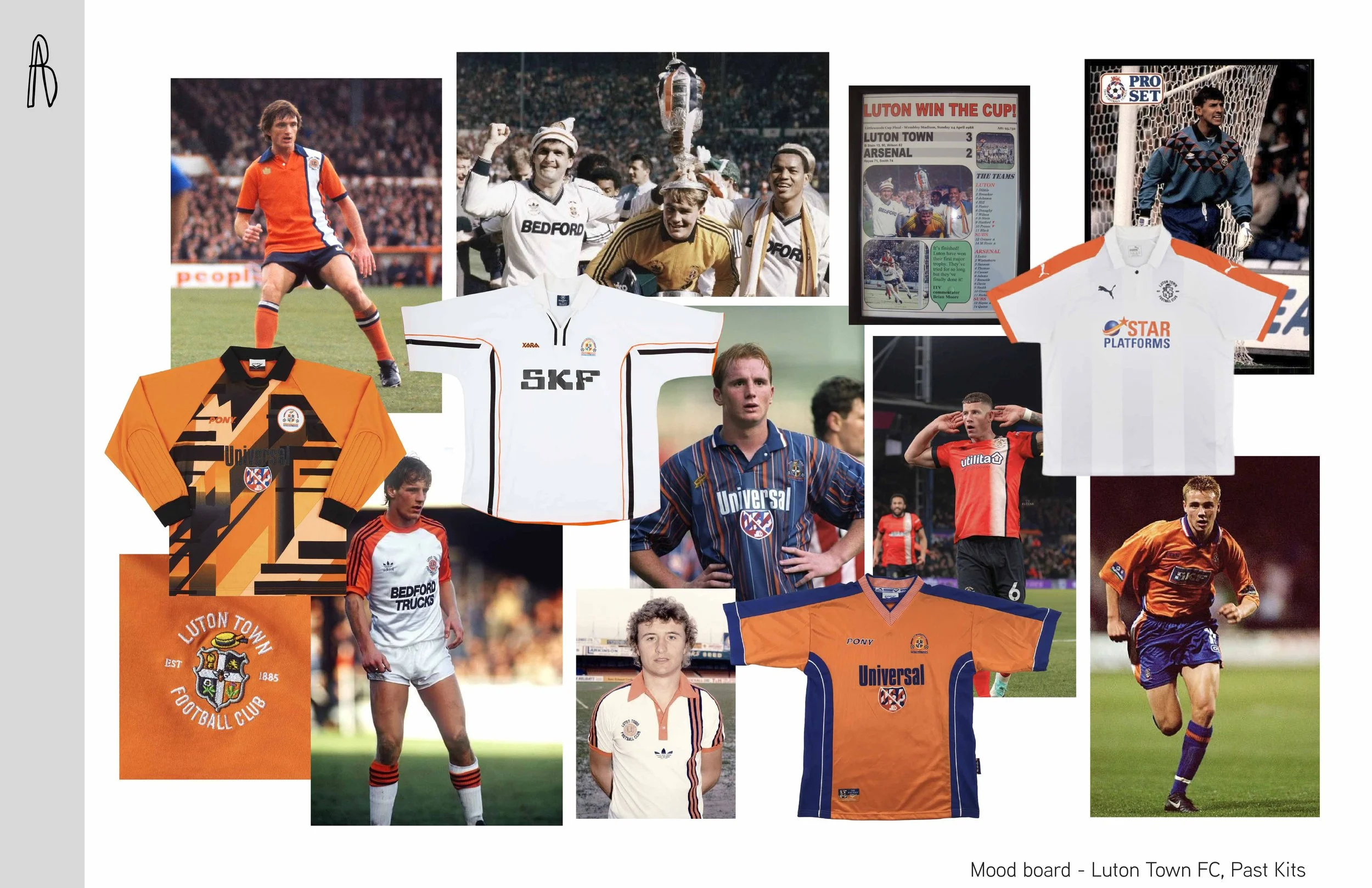
Visual research focused on Luton Town FC, Kenilworth Road (stadium), the town of Luton and the club’s identity as “The Hatters”.
References from historic football kits, supporter culture, local architecture and Luton’s hat-making heritage are combined with contemporary football and sportswear influences to create a direction that feels rooted in the club while looking forward.

Color palette
A palette built around Luton Town’s established orange, navy and white identity.
Neutral and tonal supporting colors are introduced across training, travel and lifestyle product, allowing the collection to move between high-impact match apparel and more understated off-pitch sportswear.
HERITAGE
FLAME ORANGE
#FB8B23
BLANC DE BLANC
#F4F4F2
DRESS BLUE
#2A3448
JETBLACK
#2D2A26
NEW ORANGE
TANGERINE TANGO
#E05B23
CHINO GREEN
#9D967A
CHILLI PEPPER
#9B1B30
FASHION
LOTUS
#E2C1C0
ANGEL WING
#F3EDE2
Luton Town Club assets

SPONSORS
GRAPHICS
The Rise & Fall
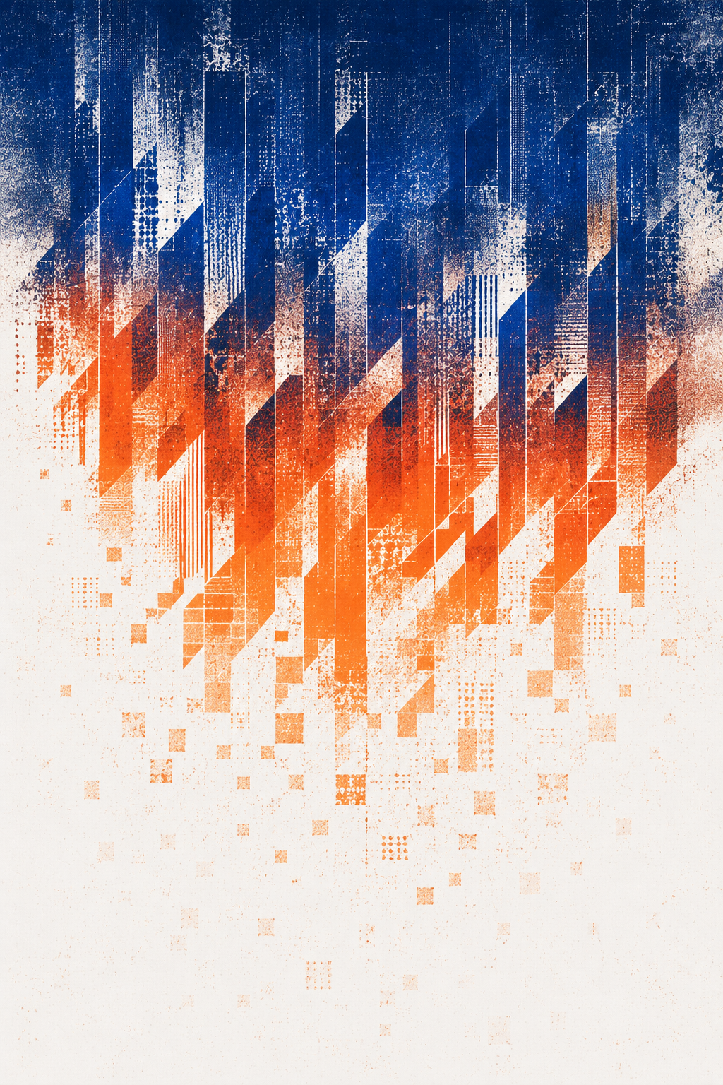
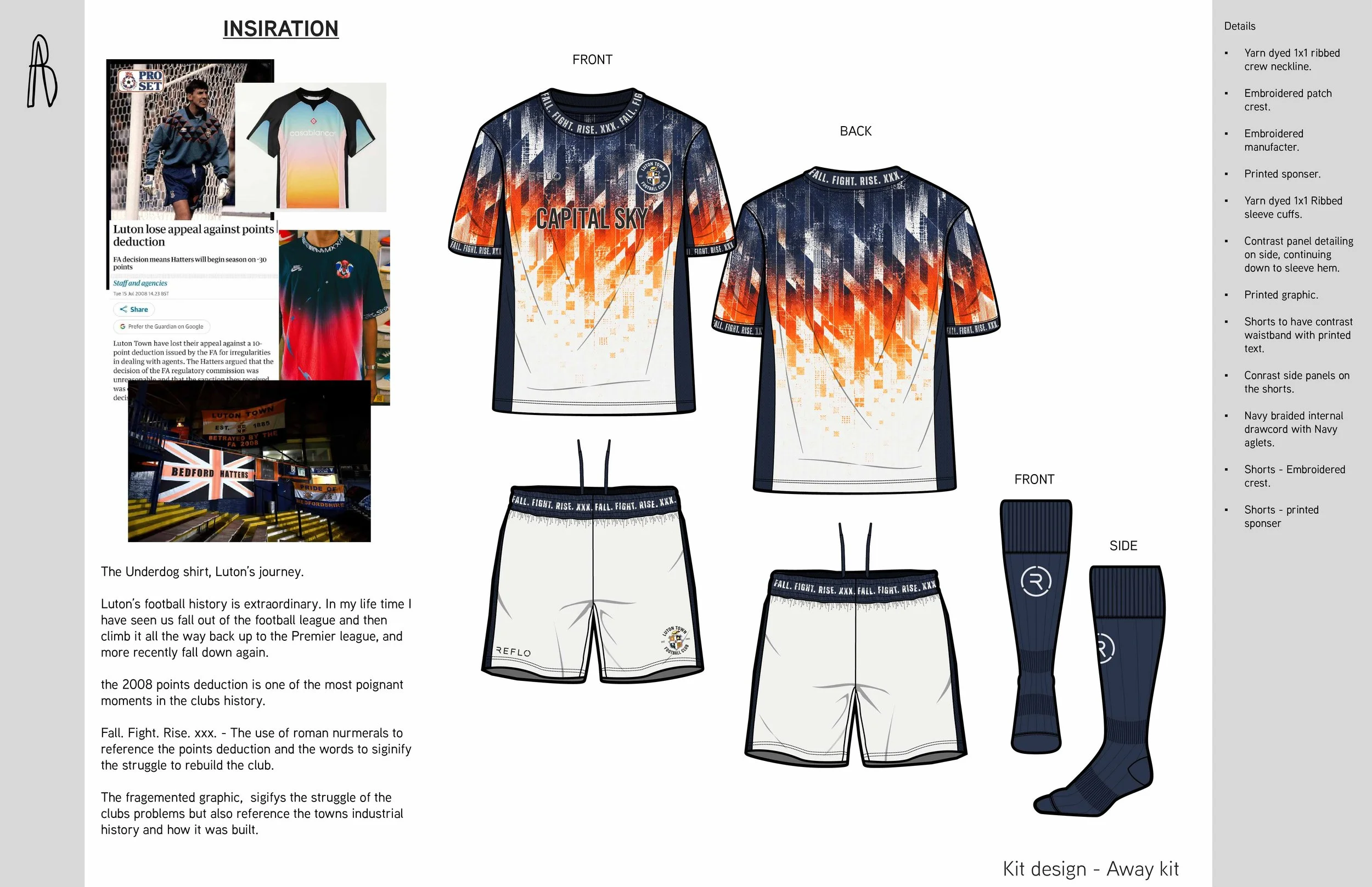
Inspired by Luton Town’s journey through the English football pyramid, the graphic transforms periods of fall, fight and rise into an abstract progression from fragmentation to unity. Industrial geometry, distressed textures and a fade through Luton’s blue and orange palette subtly reference the town’s manufacturing heritage while creating a graphic designed specifically to flow from the neckline down the shirt.
Heritage
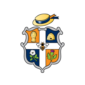
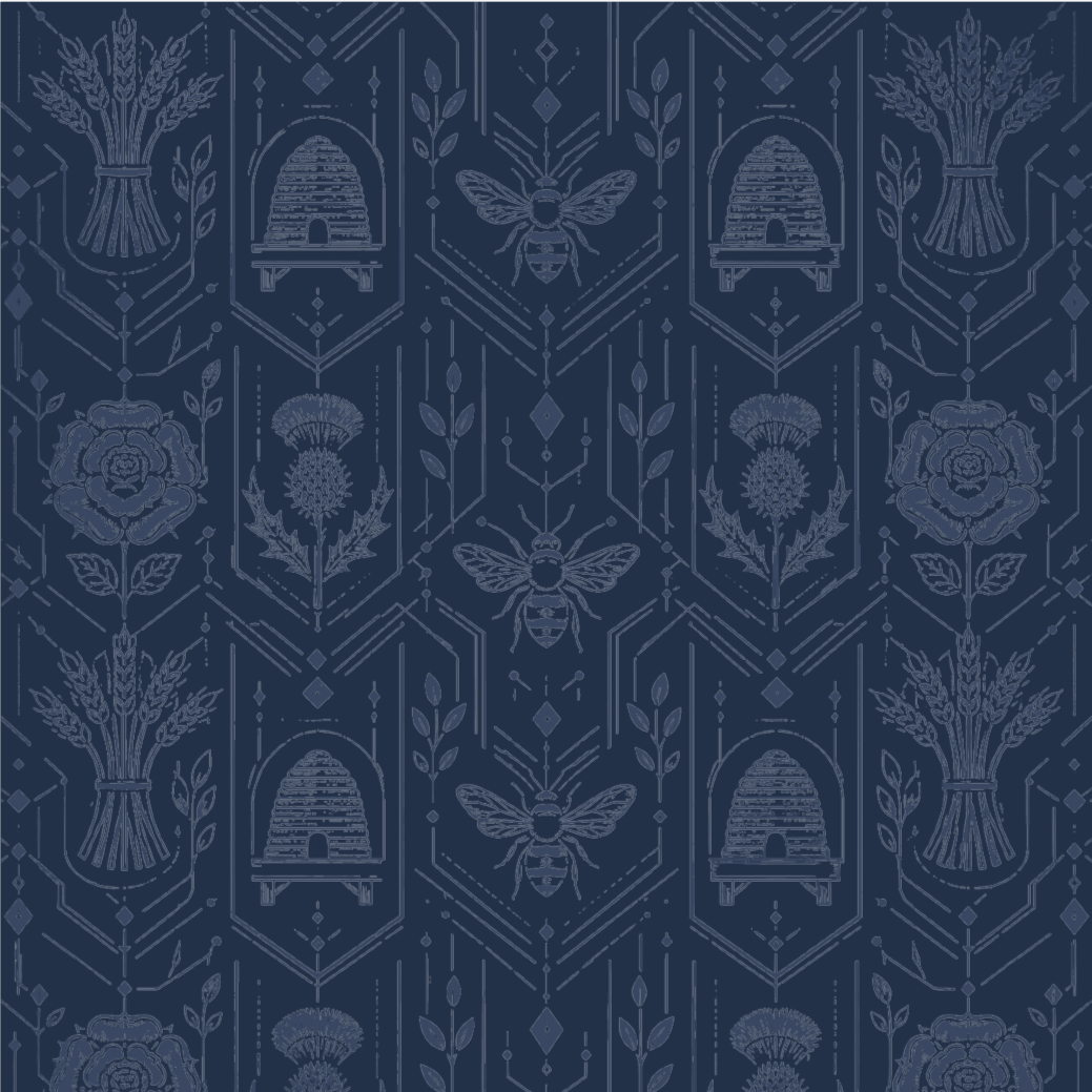
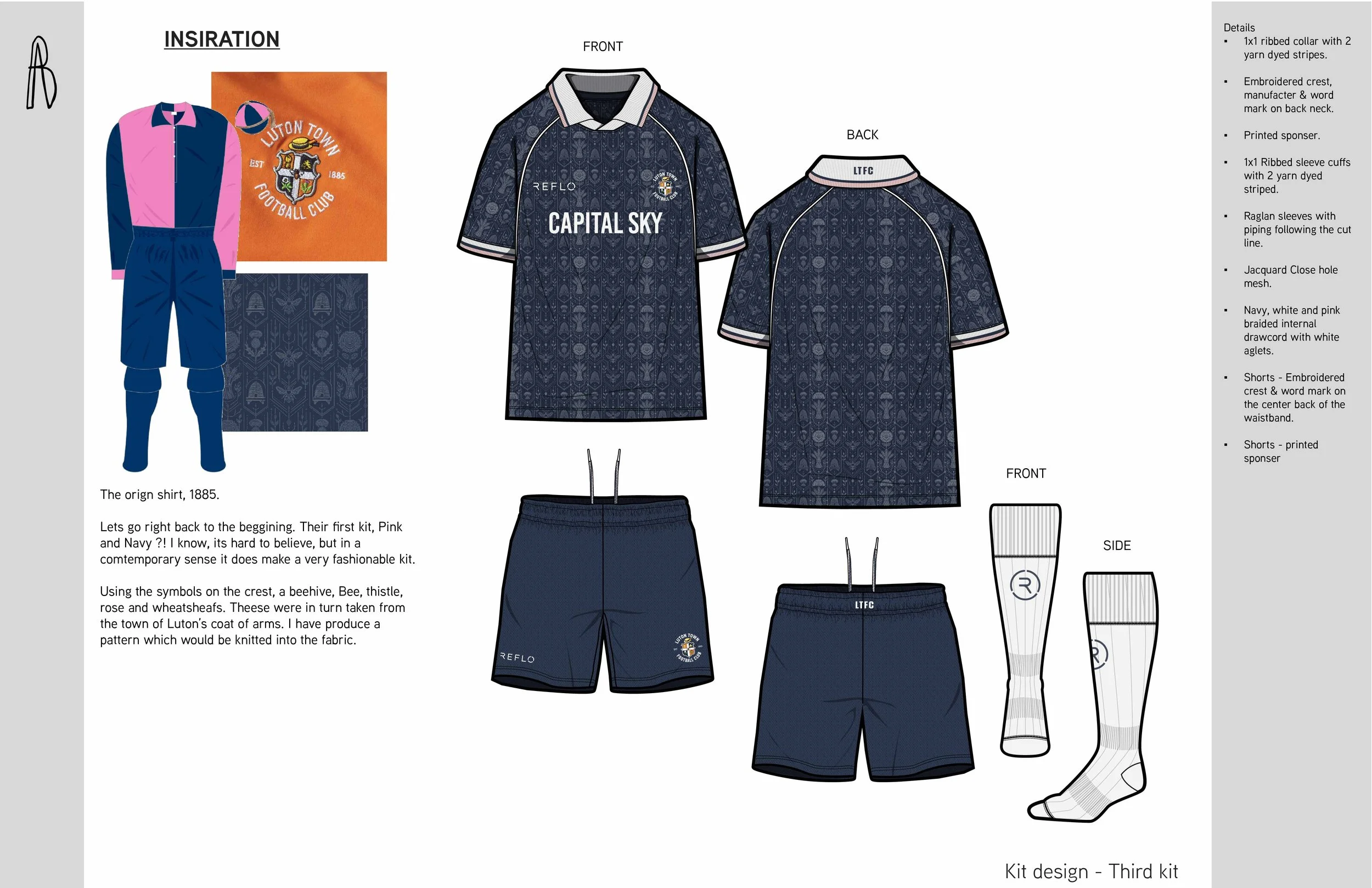
This graphic draws directly from the emblems of Luton Town’s crest, isolating and amplifying its historic symbols into a contemporary repeat pattern. The rose becomes a particular focal point, as the last element of the crest to retain Luton’s original pink shade - allowing the design to reconnect the club’s modern identity with a subtle piece of its visual history.
Matchday kits
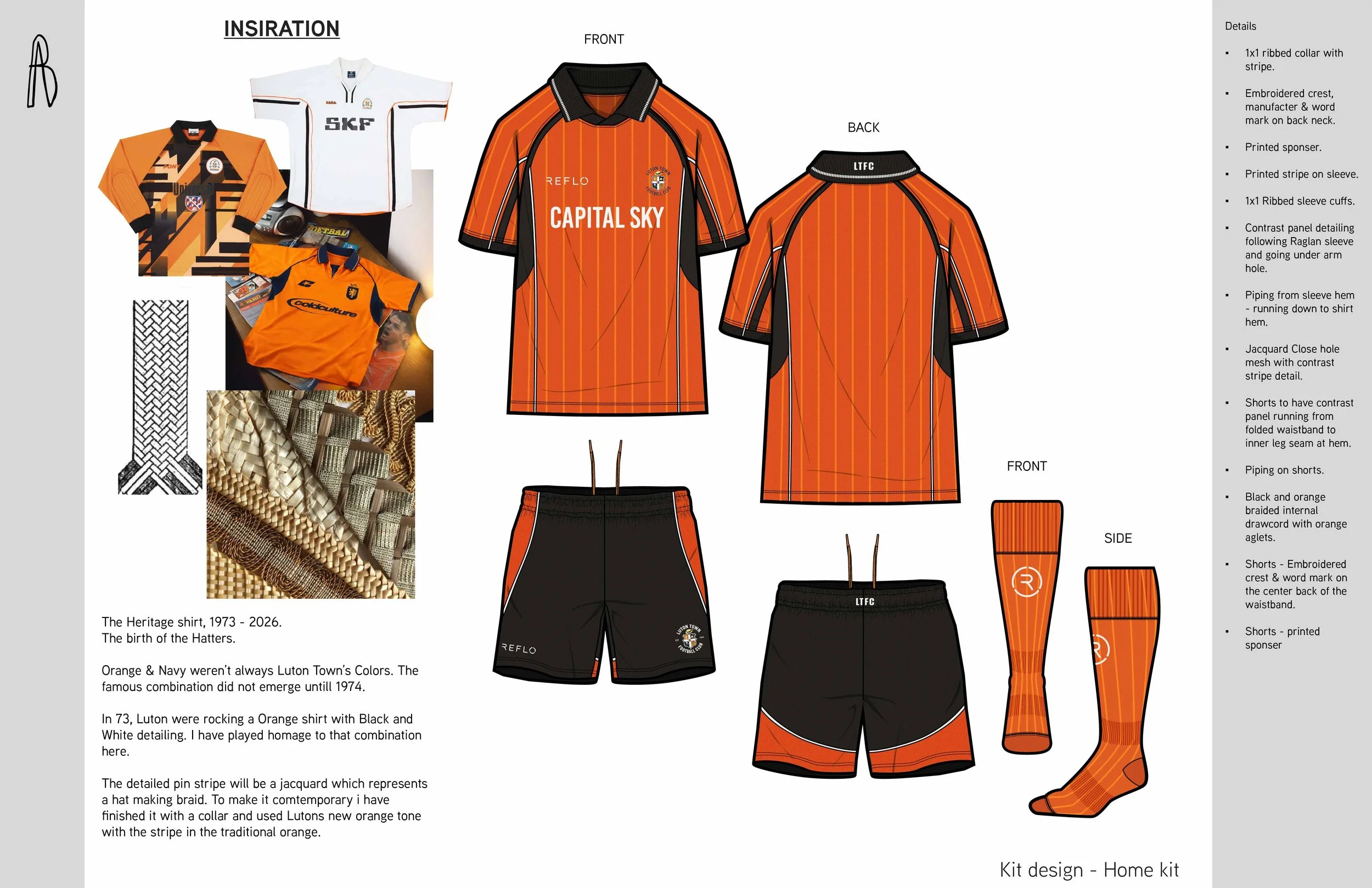
Home, Away, and Third kits developed as three individual expressions of the same seasonal concept.
The Home kit remains closely connected to Luton Town’s established visual identity, while the Away and Third kits provide opportunities to explore more experimental color, graphics and heritage references.
Each kit is considered as a complete system across shirt, shorts, socks, player names, and numbers, crest applications and technical detailing.
Outcome
This project brings together two things that have shaped me creatively: my experience in apparel, print and graphic design, and a lifelong connection to football. Designing for the club I grew up supporting made it an opportunity to explore how personal memories, local identity and club history can become a contemporary sportswear language.
Independent portfolio concept project. Not affiliated with or commissioned by Luton Town Football Club.